Baskerville’s Characteristicks
Working from multiple masters allows type designers to provide graphic designers with a wider range of styles through separate fonts. What if the range between those extremes were available manipulate at runtime on screens, allowing a typeface to respond to its context?
Ideas similar to the now-abandoned Multiple Masters font format have resurfaced within recent SVG lettering experiments by type designers Erik van Blokland, Nina Stössinger, and others (Stössinger, 2015). With this project, I will attempt to apply these concepts to an entire typeface, exploring the possibilities of setting long-form text where an aspect of the typeface can be manipulated in response to its own size, its container size, or other parameters.
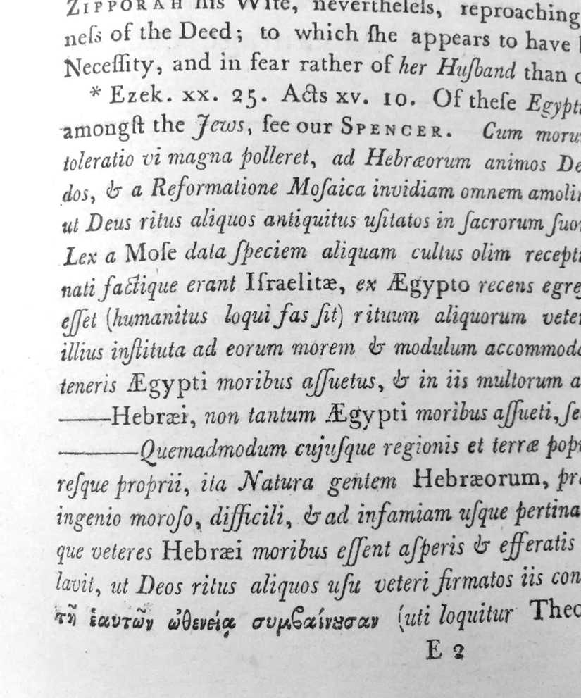
The typeface I will be designing will be a Baskerville revival, specifically based on John Baskerville’s 1773 printing of Shaftesbury’s Characteristicks of men, manners, opinions, times, provided by Jean François Porchez.

Matthew Carter’s Georgia, perhaps the most well-known screen typeface, is also based on a similar model as Baskerville. This familiarity will hopefully provide a good basis to explore this technical challenge on the web. Simultaneously, it provides me the opportunity to learn about designing text type for screens and small sizes. Characteristics uses type in a variety of sizes, which can serve as the reference to manipulate the type at various sizes when the masters are used on screen. It’s also appropriate to review Baskerville’s work in France, where his work was appreciated more than his native Britain. Fournier le Joeune wrote that Baskerville’s italic was “the best found in any type-foundry in Europe” during their day (Benton, 1914).
It’s very unlikely for the final web format to be “production-ready,” but my goal is to use this constraint to inform my revival of the typeface in one of Baskerville’s final self-initiated printing projects.
Background on Characteristicks
In 1773, Baskerville was employed by a pair of the Molini, a pair of Italian brothers and printers that worked in Paris (Mellby, 2013). The same year, Baskerville worked on his own project Characteristicks of men, manners, opinions, times by Anthony Ashley Cooper, the Earl of Shaftesbury. It was a popular book in its day, and it’s possible the recommendation to print this book came from Baskerville’s friend Benjamin Franklin. He mentioned in reference to expanding Baskerville’s foundry, in a letter to him ten years earlier (Harskamp & Dijstelberge, 2011).
Works cited
- Benton, J. (1914). John Baskerville, type-founder and printer, 1706-1775 .
- Harskamp, J. & Dijstelberge, P. (2011, December 08). John Baskerville’s tale of horror. Retrieved June 25, 2016.
- Levantovsky, V. & Levien, R. (2015). WOFF File Format 2.0: W3C First Public Working Draft 08 May 2014 .
- Mellby, J. L. (2013, June 17). Baskerville and his engravers. Retrieved June 25, 2016.
- Shaftesbury, A. (1773). Characteristicks of men, manners, opinions, times. Miscellaneous reflections on the preceding treatises, and other critical subjects, A notion on the tablature, or judgment of Hercules; With a letter concerning the art or science of design (Vol. III).
- Stössinger, N. (2015, February 16). Live font interpolation with SVG .