Typographic introductions
Once an open source typeface on GitHub is ready to use, it should have a type specimen image of some kind in the README file.
A surprising number don’t. To me, this reminds me of when a software library I’m trying to learn about has no code samples: sure, I can read the description and get a rough idea, but I have to do a little digging to get an impression. Even a single sample image in the README helps a lot.
Embedded type specimen images on GitHub
For about a year, some of the typefaces with source files on GitHub that actually do have a sample image, have a new issue: dark mode.

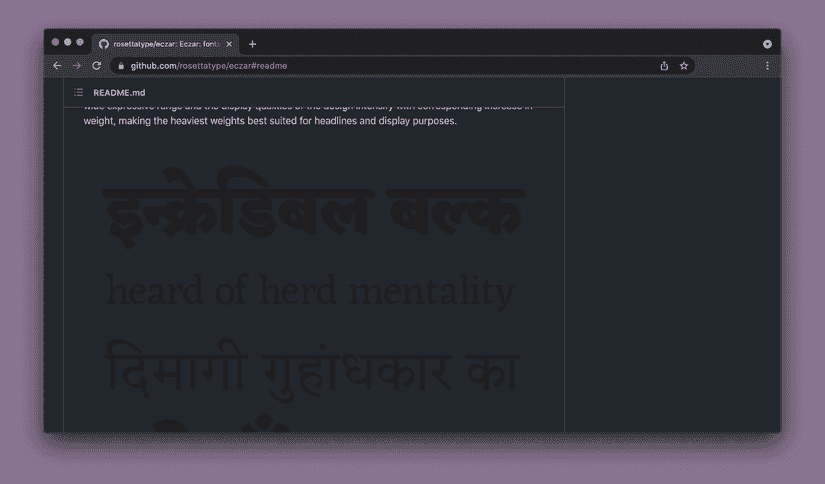
The README for rosettatype/eczar, with “Dark Mode” enabled. Yes, there is a type specimen image there.
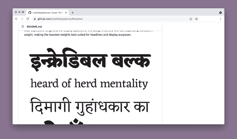
GitHub has supported a few different dark themes for months now, matching increased operating system support for dark- and light-mode interfaces. One side-effect is that if you previously had a nice, transparent background type specimen for your repository:

…a lot of people might barely be able to see it today.
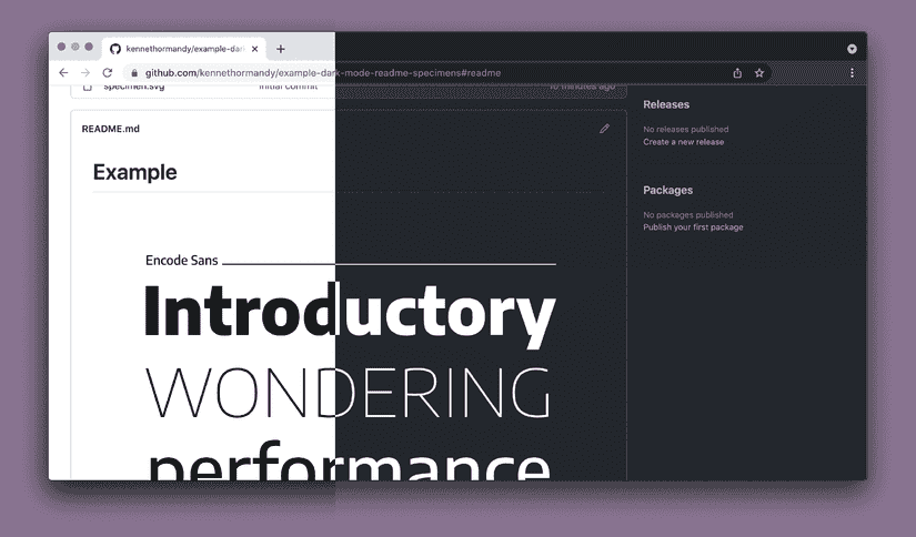
Of course, a specimen image using colours that work in both dark and light mode is one way easy way to solve this, but what if we want to make a single, monochrome specimen that works in both places?
I’m going to cover how to do both at once, within a GitHub README (or other site where you might need to use typographic SVGs), on Thursday.

Until then,
Kenneth
P.S. Feel free to reply to this email if you’ve come across this issue too, have feedback, or if already know where I’m going with this!