Choosing faux over no
Type designers know about faux styles all too well: when a writer italicizes text in Word or on the web without the necessary companion font available, the software will fake it. The same can happen with bold text.
I’ve helped web developers prevent this, and I’m sure many type and graphic designers reading this have had to do the same.
Yet, we probably wouldn’t argue that faux italic is worse than literally no italic styles—the software is preserving the intended emphasis in the text with the resources it has available. Designers want a well-designed companion italic to be considered, and made available to the software, in the first place.
Last message, I mentioned breaking (or at least bending) a typographic convention like this, which reminded me of another project that does this to useful effect: Irene Vlachou and Laurence Penney’s FauxFoundry.
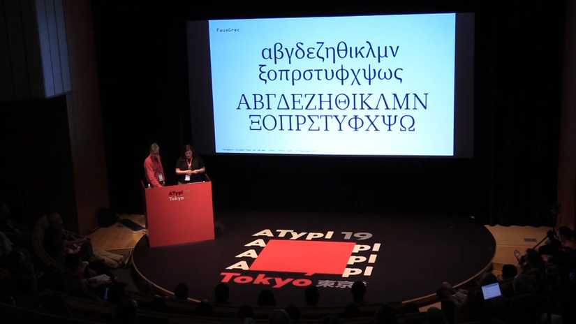
Faux Foundry is way to generate a Greek typeface that pairs well with an already-selected Latin typeface. It uses similar techniques to the generated faux bold and italics we criticize, to improve Greek and Latin multilingual typesetting.
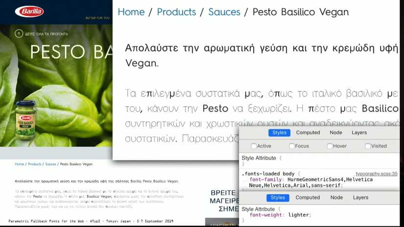
Consider a site that has been translated into Greek, but uses a typeface that has no Greek companion. Without proper consideration for the translation and the type, the results can be a pretty unfortunate:

Instead, Faux Foundry can offer a solution better than the default, by generating a Greek companion font based on the characteristics of the selected Latin font.

Vlachou & Penney demo FauxFoundry in their Parametric Fallback Fonts for the Web talk
These faux styles are “wrong” if you follow conventional typographic wisdom without any nuance, but the result for readers is clearly better than the alternative. To me, this was a timely reminder to pursue the reason for the rule, rather than the rule itself.
Until next time,
Kenneth