Specimen preview links
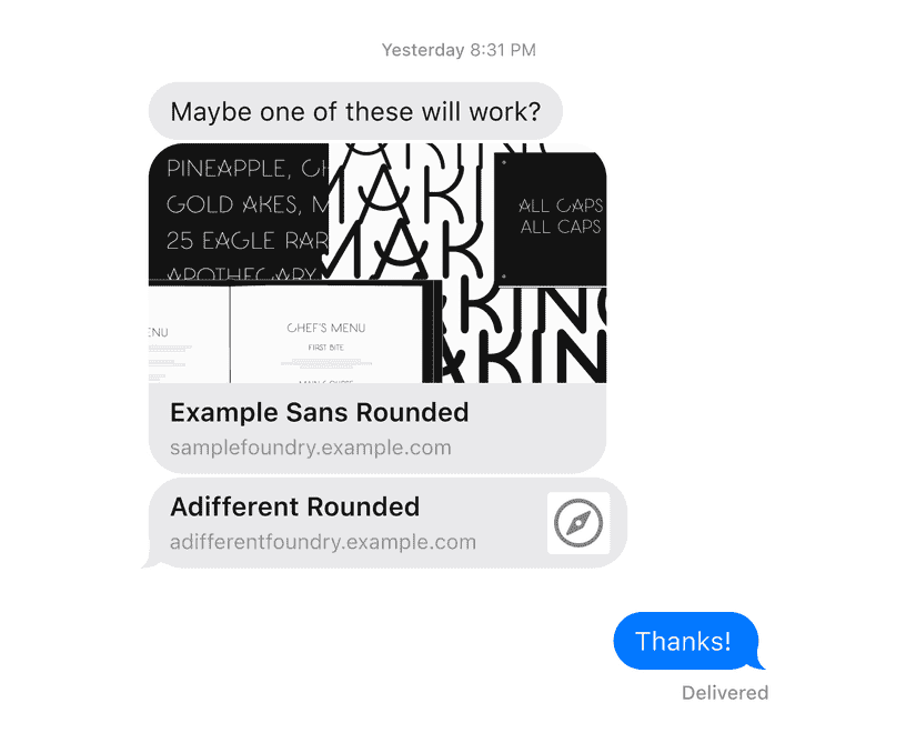
When someone shares a link to your typeface, you’d like it to be presented in the best possible light, before the recipient even clicks. Which of these typefaces do you immediately know more about?

Social media “cards” or previews help make this possible: rather than a plain link, platforms and apps like Twitter, Slack, and iMessage can show a type specimen image and detailed typeface description instead.
Someone is effectively giving you a referral. I think there’s an opportunity to make those links compelling, using details and imagery you’ve probably already made.
Content Management System and ecommerce platforms can be configured so this information is filled in once per typeface, and then works across your entire catalogue. Perhaps all the information is there already, and it just need to be put to work in another context.
This is my checklist for one-off type specimen sites, where these details are typically filled in manually:
Preview Image
- Consistency Is there consistency between the preview image, and the first think the person will see after clicking the link? One easy way to do this is to make the page’s header image the same as the social media preview image. Otherwise, if all the specimens for that typeface have a theme and visual identity, then this has already been accounted for.
- Aspect Ratio The image should have an aspect ratio of 1.91:1. Some platforms built around sending messages often don’t impose an aspect ratio, and this one will also work for platforms like Facebook and Twitter that do. While social platforms have inconsistent and changing constraints for posting media (ex. sharing a one-off specimen on your Twitter timeline), the 1.91:1 aspect been stable preview images from links.
- Dimensions Many articles will recommend explicitly making these preview images 1200×630px. Personally, I’d prefer I’d probably make them a multiple of this and allow the software to downsize. That way, you can still have higher resolution previews in the future, even if some platforms scale them down to 1200px wide right now.
- File size The file size should be optimized. Some platforms won’t show large or slow-to-load images (ex. Slack’s cap is 5mb, which is very large for this scenario).
- Alt text The alternative text for the image, ie. how the image should be described to people using assistive technology like screen readers, should be filled in. I’ll write about this more in a future email, as I find writing alt text on typeface sites a little different from other sites.
Description
A sentence or two summarizing your typeface, for busy people skimming on screens. It should be between 50 and ~155 characters.
This recommendation is for search engines like Google, rather than for social media cards specifically. For example, Twitter allows up to 200 characters, and you could provide it unique description. However, I think it’s easier not to take them up on that offer: I write a single description, and know it will work across platforms.
Title
The full text title should be under 50 or 60 characters. Otherwise, it might be shortened.
That said, I find it’s more common for a typeface page to have a title is too short, rather than too long. You might try want “Example Sans typeface” or “Example Sans font” or even “Example Sans font, from Sample Foundry”.
It’s common for a site-wide title to be combined with every individual page name too, like “Example Sans | Sample Foundry”. That should be configured across your site, rather than something that gets filled in per-typeface.
If you’ve done all that for your site as a whole, it works equally well as the title in your social media card.
Having these details filled in lets potential visitors see your typeface before they’ve even clicked a link.
Ideally, for larger catalogues, your CMS or ecommerce platform will create these for you from information you need to fill in anyway.
Have you tried to fill in social previews for your entire typeface catalogue on your own site? How did it go? sI’d be curious to hear.
Until next time,
Kenneth