Responsive
Most plugins that prevent trailing lines, do so by inserting   (a non-breaking space) between the last final two words in a paragraph.
For example:
<p>
…a long paragraph, much longer than
the line length of the container.
</p>Certain plugins, you can configure, so if the last word is long enough, you wouldn’t bother with this functionality at all. The thinking is the last word is going to be long enough to keep the paragraph feeling balanced, even if is the last word on the line.
But the length of the final word is not the only consideration: the line length matters too.
Making this a plugin setting is nearly impossible—most of these plugins run on the server, and produce or modify HTML, but don’t know anything about the context the text is ultimately going to be displayed in. They don’t know anything about how things look when you are reading the text in the browser.
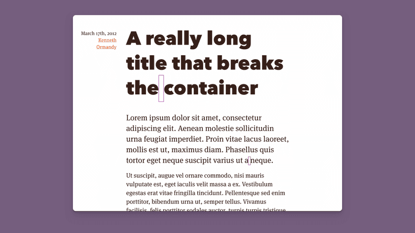
The same thing can happen in headlines as well as paragraphs:

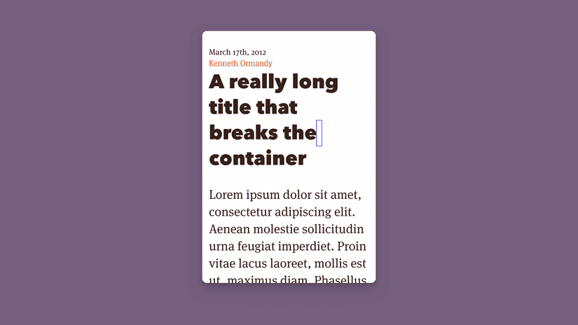
Keeping “the” and “container” together here helps balance the headline. But if we’re on a smaller screen, keeping them together—what the would do—would simply create a gap the line before.
Instead, by wrapping the non-breaking space in a span, and applying a CSS class:
<p>
…a long paragraph, much longer than the lin length of
the<span class="nbsp"> </span>container.
</p>…we can switch it from behaving normally or not doing anything, to effectively enable or disable trailing word prevention. The CSS could look something like this:
/* Ignore the breaking space */
.nbsp {
  display: inline-block;
  outline: 1px solid blue;
}

/* Restore it at larger screen sizes */
@media (min-width: 550px) {
  .nbsp {
    display: inline;
    outline: 1px solid purple;
  }
}
So we can ignore trailing words when the screen size and line length is shorter:

…and keep them around like in appropriate cases, like the first example.
Until next time,
Kenneth