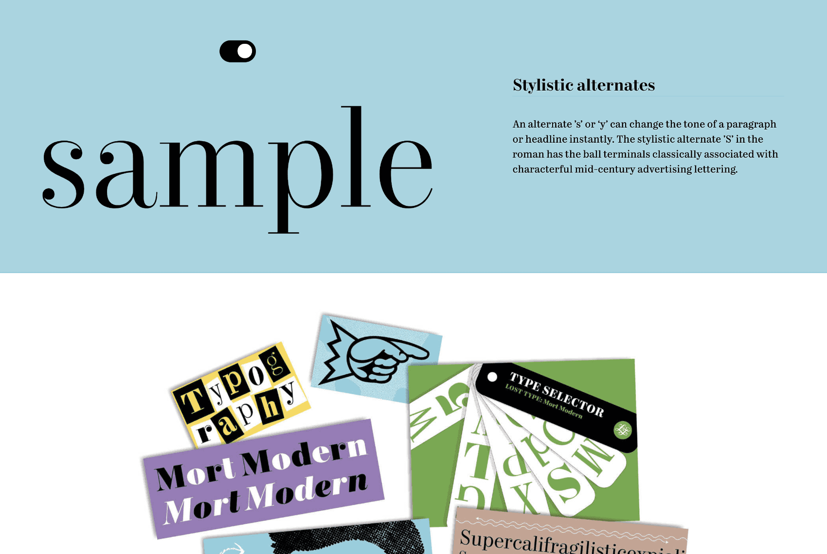
Mort Modern type specimen site
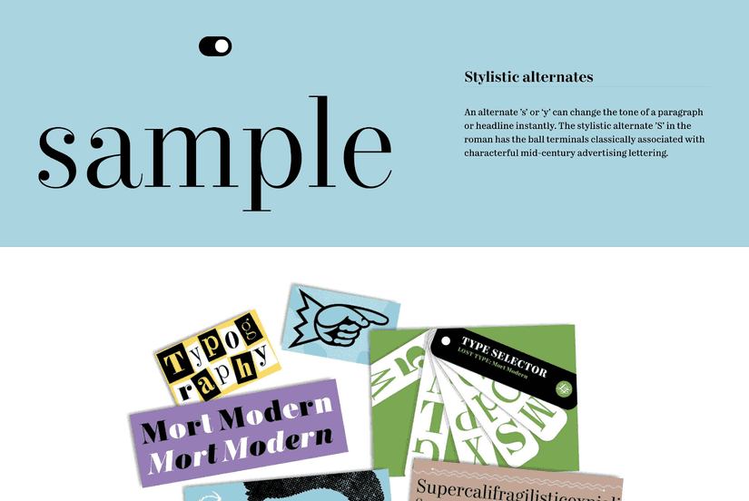
Mort Modern type specimen site
Riley Cran’s Mort Modern type family was his most comprehensive retail typeface release to date. Building on our experience building the Moriston and Escafina type specimen sites, we sought to make the site an even more cohesive piece of the visual identity for the typeface.
The site, alongside the printed Mort Magazine, and a social media campaign, demonstrates some of the possibilities of the typeface, all with a consistent visual voice.
This was noticed both by graphic designers interested, and by web designers and developers in the site itself, all as a way to get them more interested in typography, and this specific typeface. This included designers like Jeffrey Zeldman, Una Kravets, and Kirill Zakharov of Unsplash:
♛ Wow! Mort Modern—a serif typeface in 56 styles designed by @RileyCran, inspired by the lettering work of Mortimer Leach. Fab font family, super single-serve web presentation. Hat tip: @fredgatesdesign.https://t.co/Y1FzvzqXds pic.twitter.com/xPfjV4nGXt
— zeldman (@zeldman) August 17, 2018
Mort Modern: beautiful typeface, beautiful sitehttps://t.co/Ql1ctQlAv1 pic.twitter.com/Znr0xqv828
— 🇺|🇳|🇦 👩🏻💻 (@Una) March 19, 2018
OK. This Mort Modern website by Lost Type is freaking awesome. https://t.co/GCkWNfSWbK
— Matinee Creative (@MatineeCreative) February 6, 2018
Type designers have some of the nicest websites. Here's one for @rileycran's latest typeface: https://t.co/W7jhWRMdFT
— Kirill Zakharov (@kirillz) January 11, 2018
After working on Mort Modern for many months, Riley has understandably shifted his focus to new projects, but the site is still showcasing his hard work to new audiences.
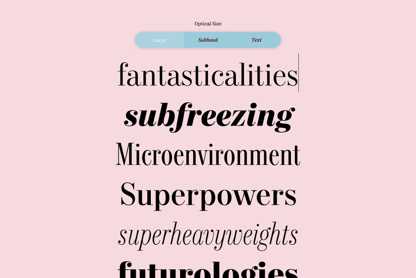
A double-sided site
One of the design elements of the Mort Modern site was a series of double-sided cards that showed a specific details of the typeface on one side, and a more graphic demonstration on the other.
To demonstrate how Mort Modern is put together, I worked with @grayhood to design 10 double sided card specimens. Each one focuses on a particular aspect of the font family, from the lining figures, to the idea of the roman + italic pairings, to optical sizes and widths. pic.twitter.com/mWMzXX80cb
— Riley Cran (@rileycran) January 11, 2018
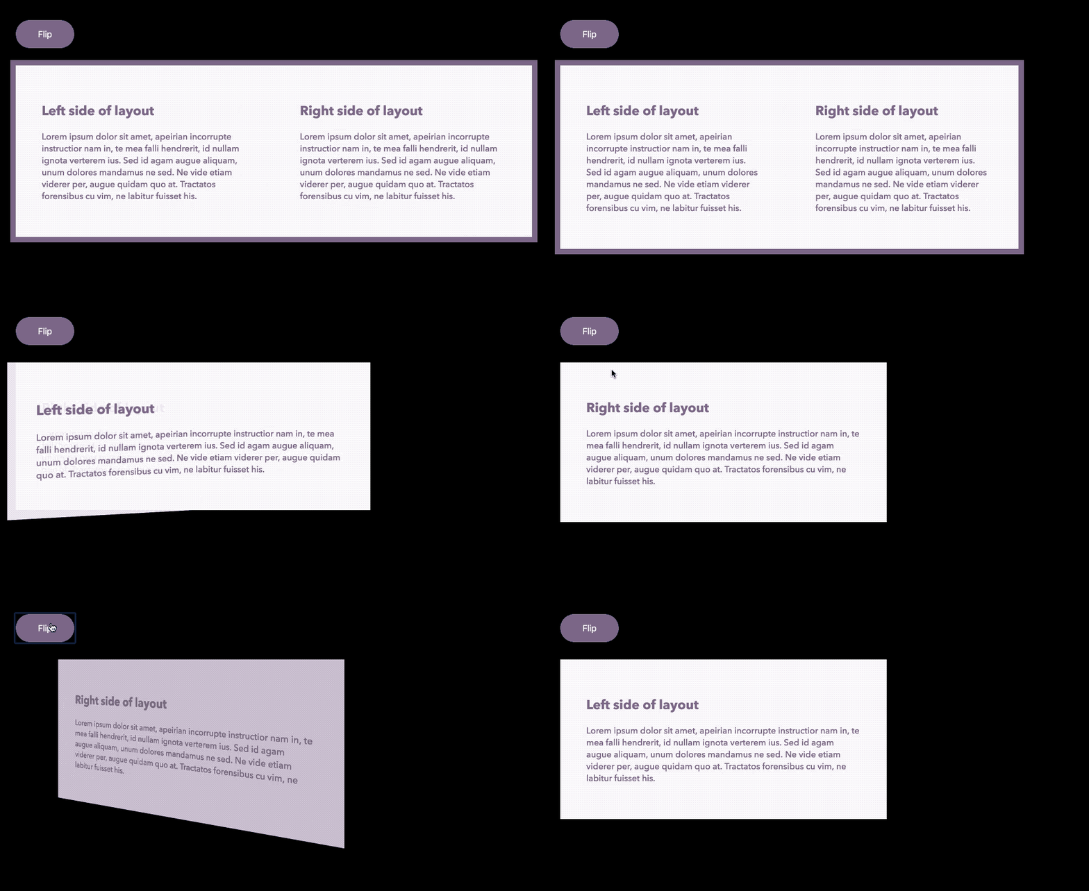
I wanted to translate this same idea to the site, by making (nearly) the entire site flippable. On one side, you get the Mort Modern article, based on the print design for Mort Magazine. On the other, you get the type specimens and interactive tester that show the typeface in use.
When there’s enough room on larger screens, we switch to a two-column layout that shows everything at once.
Later on, I open sourced a generic version of the custom React Flipcard component:
The dropcaps
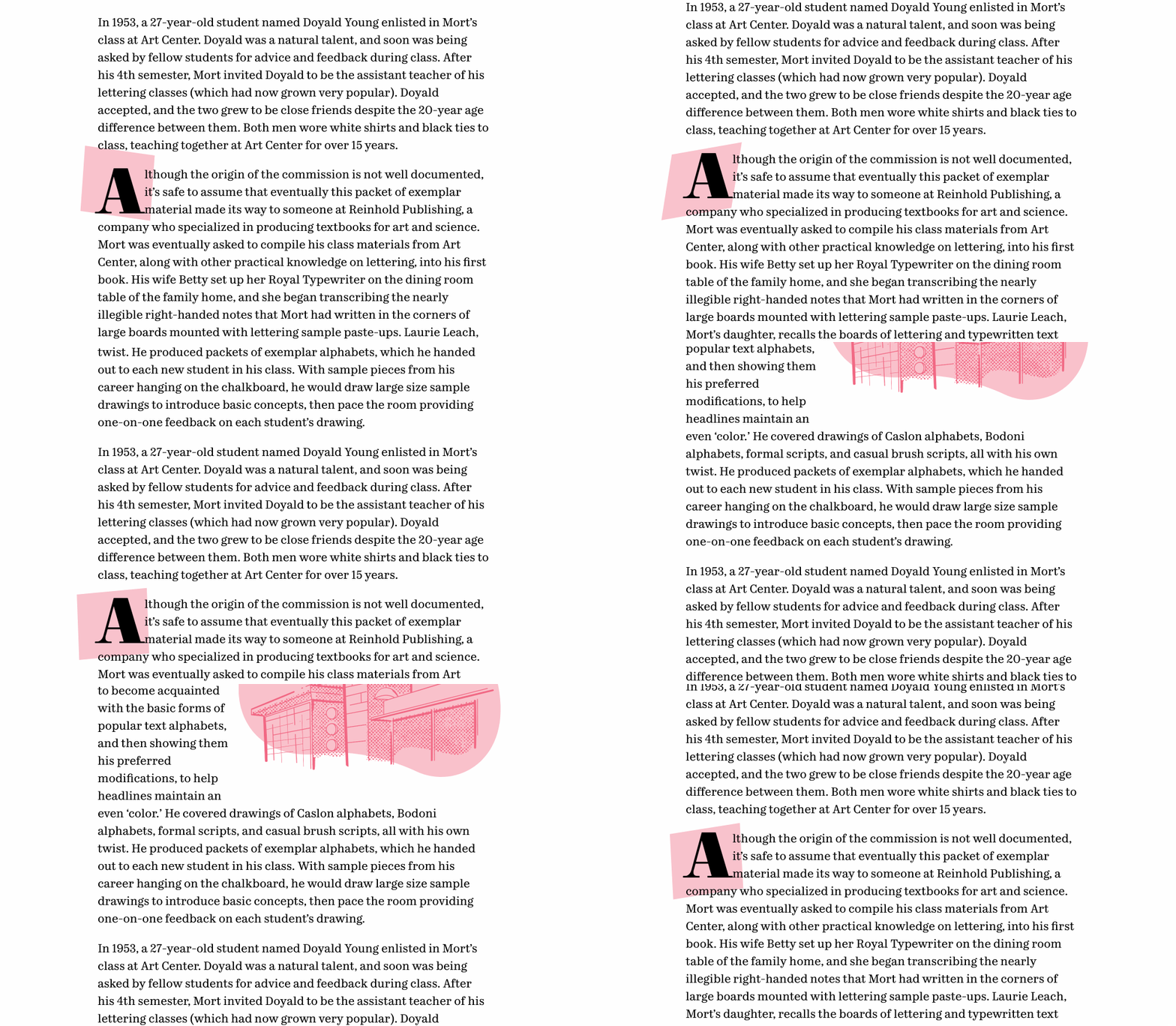
Building on the Mort Magazine print design, the article sections are highlighted by dynamic dropcaps that change as you scroll through the article.
OpenType features
The OpenType features in the typeface are highlighted with individual, editable explainer sections, demonstrating the amount of consideration in the typeface, and explaining what those features actually are for graphic designers that may or may not be familiar with them.