Prospectus type specimen site
Prospectus type specimen site
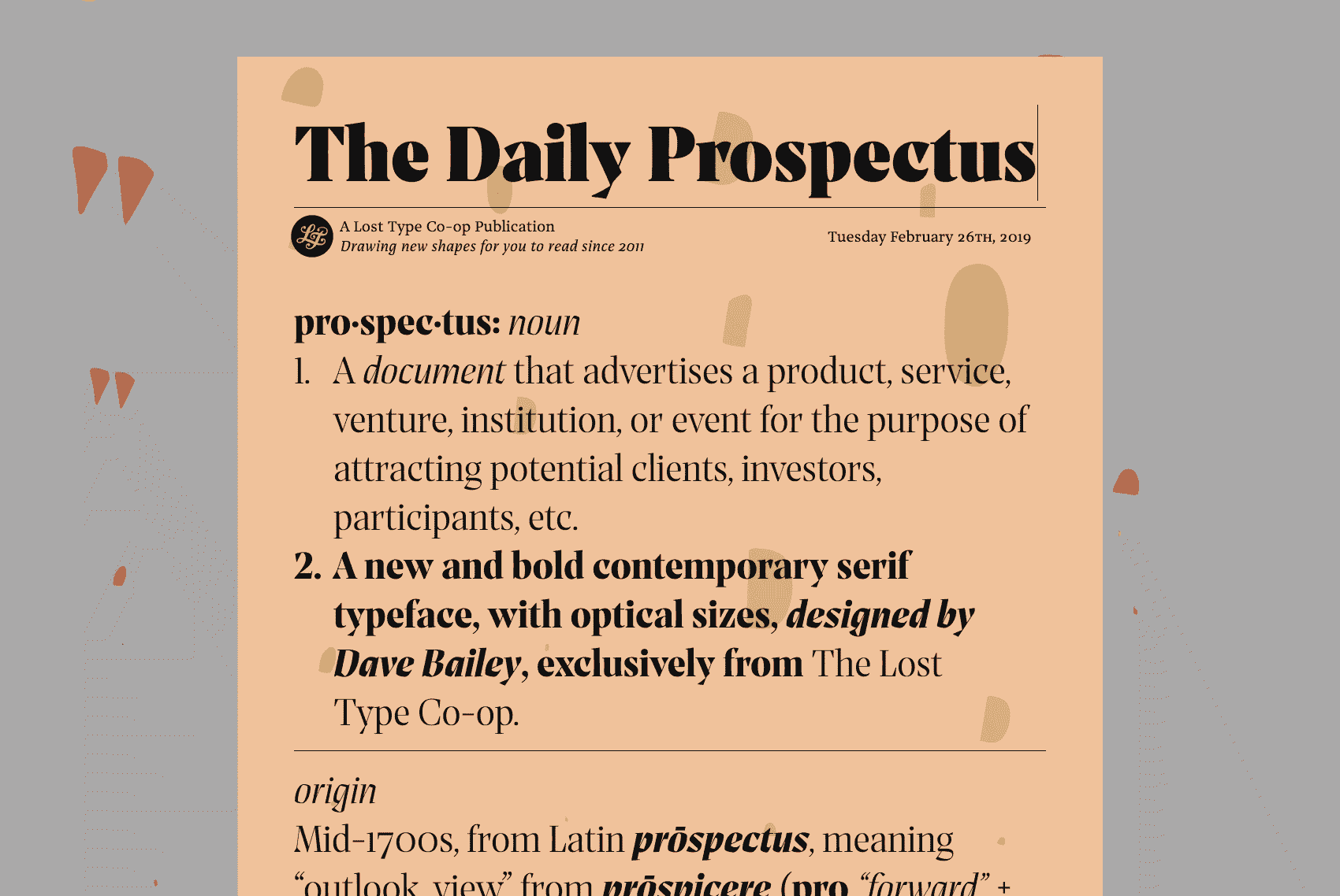
To promote and demonstrate Dave Bailey’s new, comprehensive, serif typeface Prospectus, I worked with Dave and the Lost Type team to re-imagine their early specimen designs for the web, and develop a custom type specimen site.
Optical Sizes
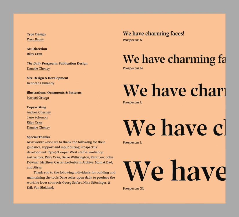
One of the main considerations of the typeface we wanted to highlight was Prospectus’ range of optical sizes.
In addition to showing Prospectus in type specimens, it’s also used in practical ways throughout the site:
- Prospectus Small is used for the smallest article for the site.
- Prospectus Medium is used on the type specimen site for subheadings, and the larger introductory paragraphs in the article.
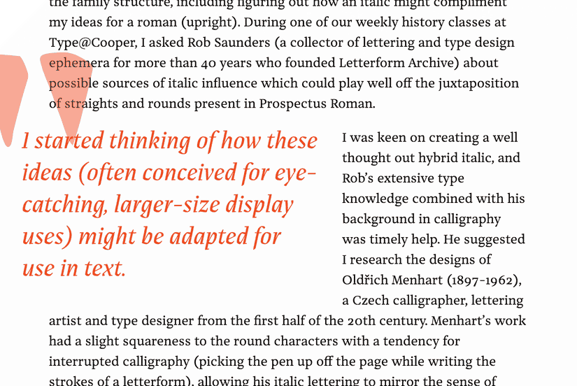
- Prospectus Large is used for the main editable heading on the site, and for the occasional pull quote in the article.
- Prospectus Xtra Large is intended for such large sizes, it’s only used in a practical way in the headings if your screen size is very, very large.

Dave wrote more about the specifics of optical sizes in the article on the site: prospectus.losttype.com.

We wanted to make it easy for people to see these in action, and not make assumptions about whether or not they would be familiar with the concept of optical sizes or size-specific type.
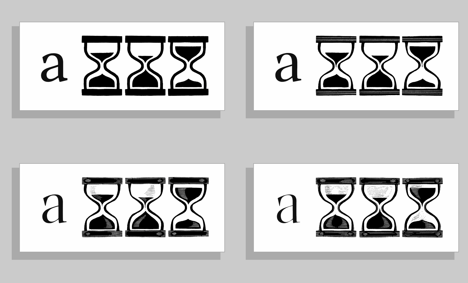
By default, the type tester chooses the correct optical size for you based on your current type size. It’s only if you want to start changing the font style to a specific optical size (Small, Medium, Large, Xtra Large) that you’ll need to control it manually. We also put together a section that pairs the optical size with a corresponding linocut illustration from Marisol Ortega:

This plays as you scroll, but can also be controlled manually or edited to include your own text.
Reactions
Featured
- Responsive Web Design @rwd
- CSS Tricks
- Sidebar.io