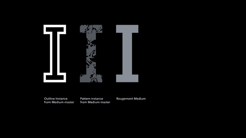
Rougemont
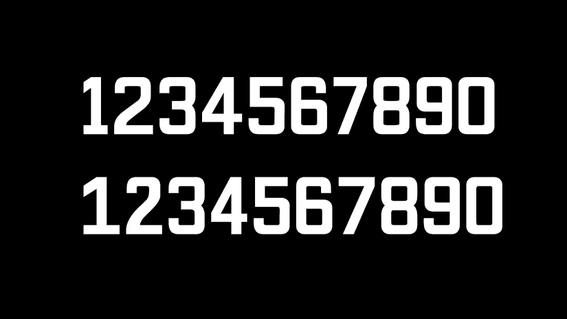
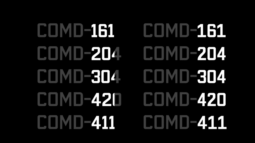
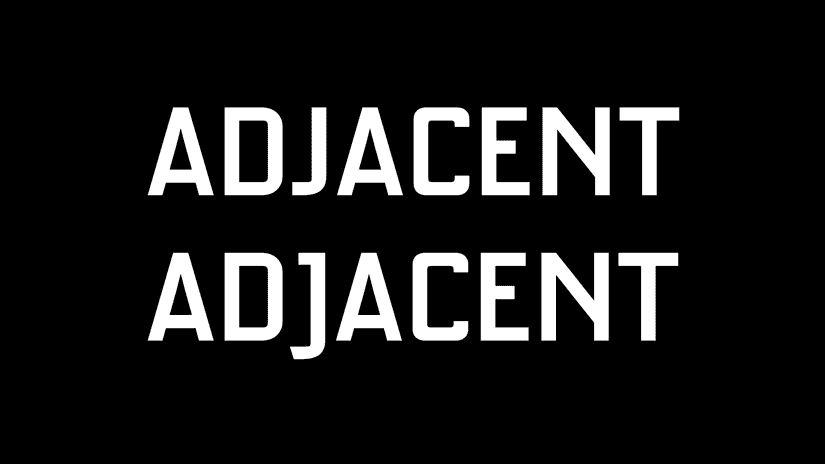
Roguemont is a type family originally drawn from gilded lettering on the Rougemont Heritage House in the West End of Vancouver, BC. It has seven styles and a consistent width for glyphs across weights.
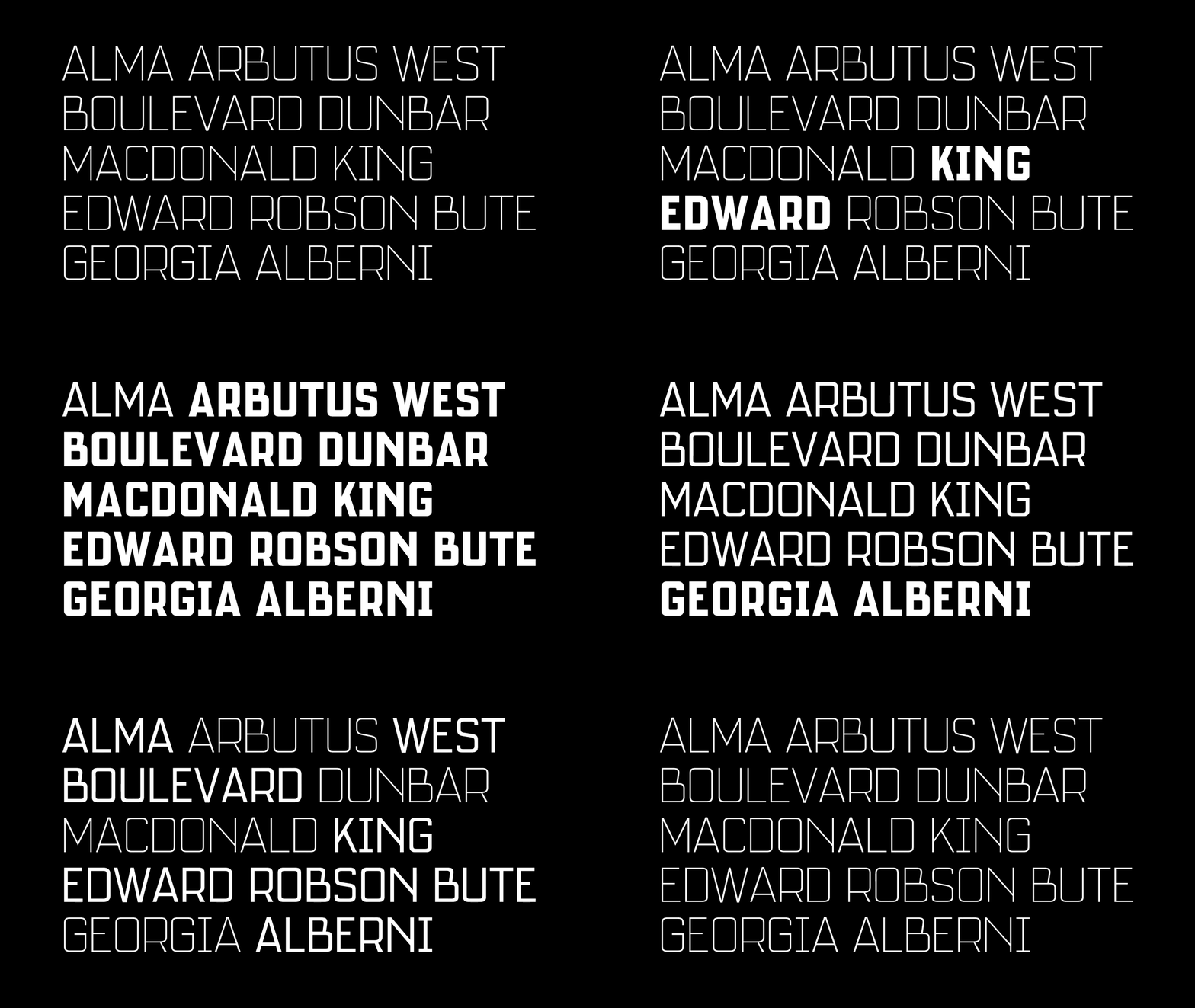
This quality makes it especially suited to display settings where emphasis needs to be changed over time. Phrases can be switched to different styles—from thin to heavy and back again—without re-flowing headings.
The Rougemont
Details on the Rougemont building have been challenging to find:
This 1911 bay-windowed Edwardian apartment block, designed by architect EE Blackmore, is not listed on the Register.
Apparently, despite being classified as a Heritage building, it was left out of the surveys. I’ve only found praise for the state of the building, but no details on who the lettering artist was.
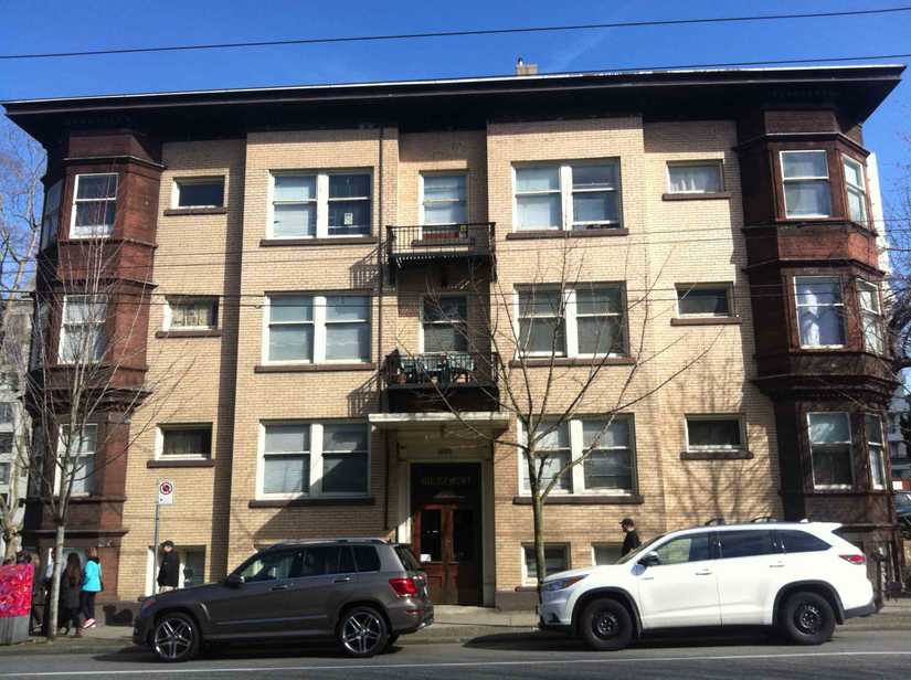
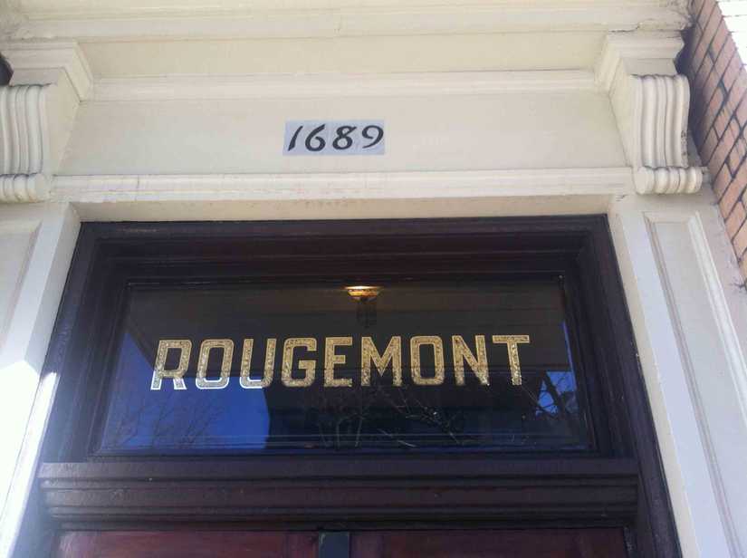
The gilded sign on the Rougemont heritage building.
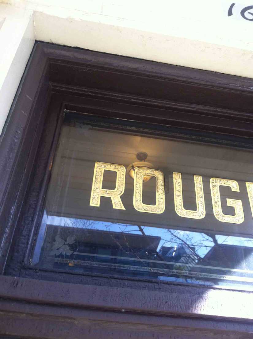
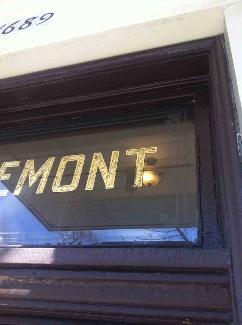
Close-ups. At least—as close as I could get for now without taking a ladder.
Additional concepts
While sketching for this initial version of the typeface, I explored a number of different directions for the glpyhs that weren’t in the original Rougemont lettering:
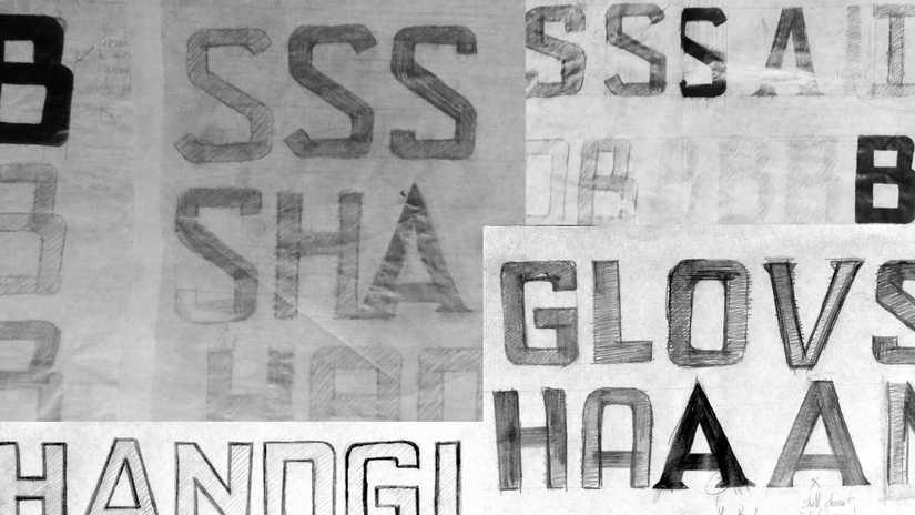
Sketches for the B, S, and A.
I also experimented with an inline and fill style of the typeface. These are only early concepts, but show how multiple versions of the typeface could work together either layered or as a colour font:
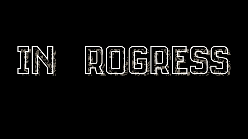
An early “in progress” concept of the inline style, before the P had actually been designed. The textured fill style would reference the original gilded letters.
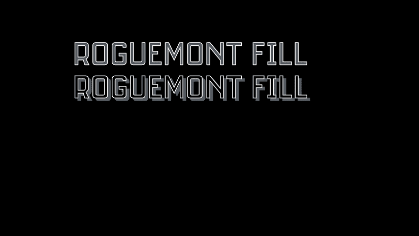
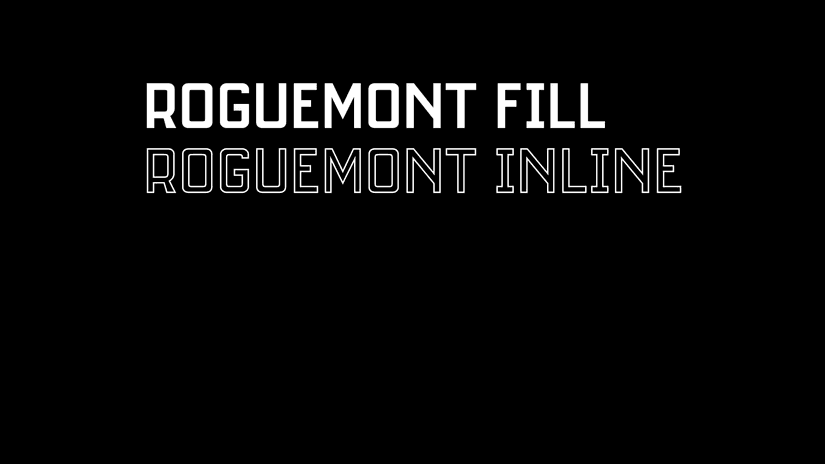
Simple examples of how the fill and inline styles could be used together.
