Verdura typeface
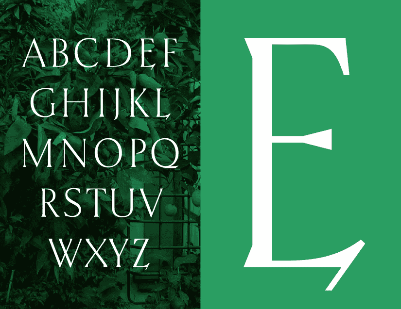
Verdura offers fast and fresh salads, soups, and grain bowls in Vancouver. Glasfurd & Walker developed a custom wordmark for Verdura, and I helped them to expand it into a custom typeface.
The typeface combined and distinctive shade of green establish the visual identity across packaging, stationery, in-store signage, social media, and more.
Featured
Brand New on the visual identity and custom typeface:The identity by local firm Glasfurd & Walker relies on a stunning custom typeface that has a crisp, elegant, contemporary look that works particularly well in the shade of green chosen.
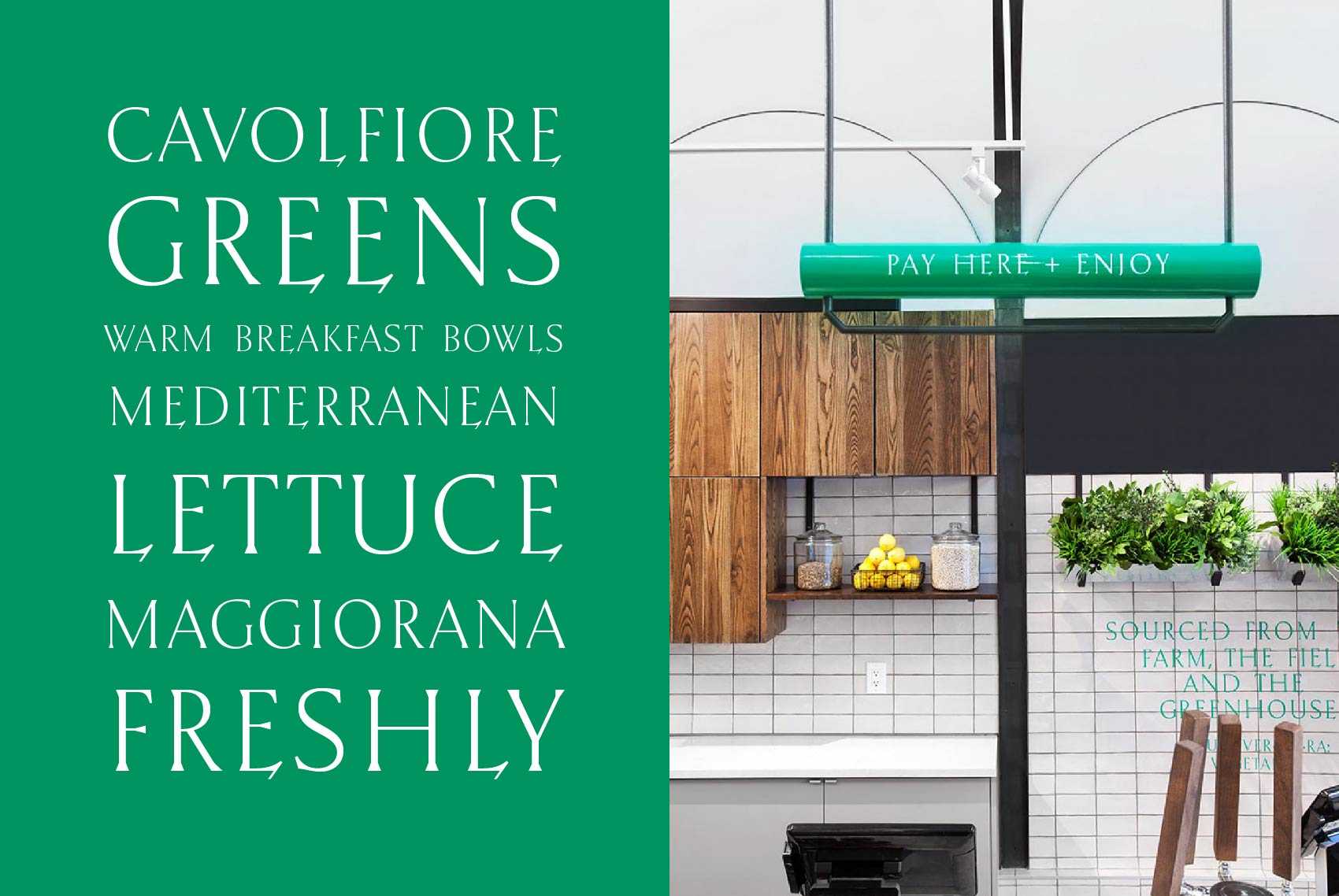
Interior and packaging applications
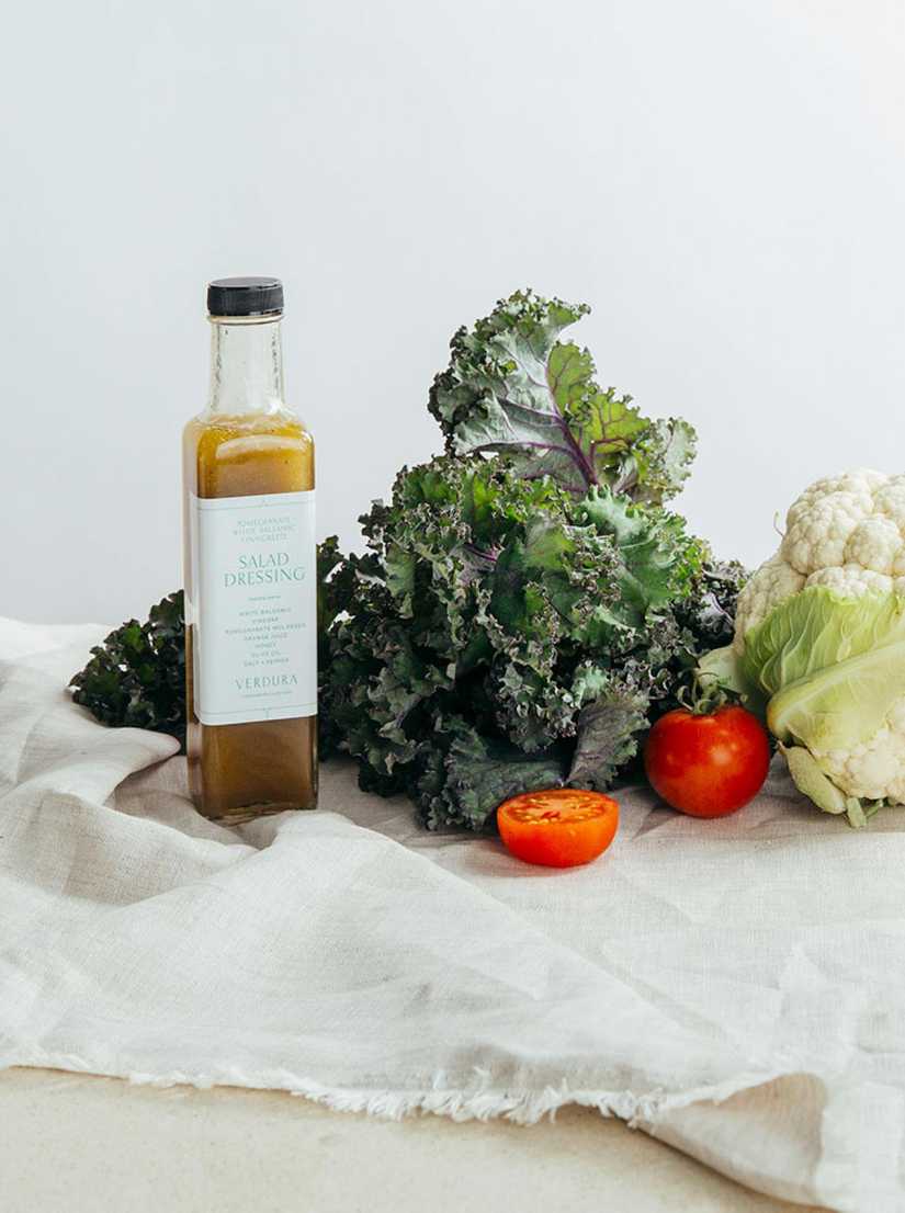
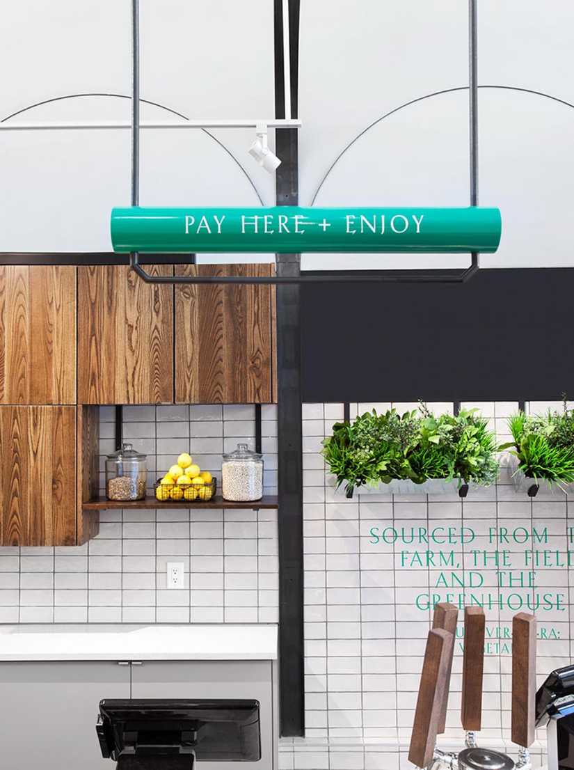
The typeface is used across Verdura’s packaging, and within the restaurant itself.
Design by Glasfurd & Walker. Food Photography by Paper and Page Studio. Interior Photography by Krista Jahnke.
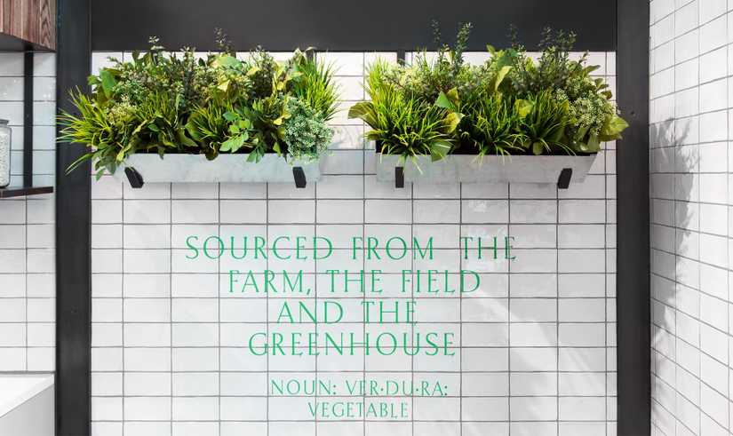
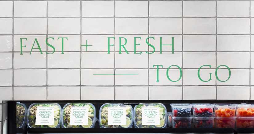
OpenType features
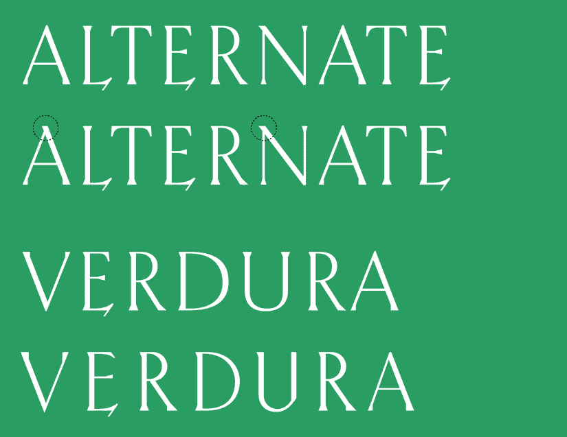
An alternate A that relates more to the N and M has been included as a Stylistic Alternate OpenType feature. This could become the default if you have a preference between the two.
There is also a single use of the Ligature OpenType feature: if you type VERDURA in all capital letters, the word in the typeface will be replaced with the vector drawing of the official logo.
Writing out the word Verdura in title or lowercase leaves it unchanged.
