Web type west
Web Type West was a one-day conference on web typography, at Emily Carr University of Art + Design, in Vancouver, BC. What follows is my cleaned-up live notes from the event.
- 9:15 – Grant Hutchinson, Can You See Me Now?
- 9:45 – Zara Vasques-Evens, Typography for Interactive Design
- 10:15 – Break
- 10:40 – Brian Warren, Thinking Typographically
- 11:15 – Stephen Coles
- 11:45 – André Mora, Just Right
- 1:15 – Typekit Library
- 2:10 – Kevin Larson
- 4:15 – John Hudson, Size-specific fonts for online advertising
- 4:50 – Xerxes, Realtype
9:15 – Grant Hutchinson, Can You See Me Now?
On the web, text comes first. Hutchinson runs new sites in old browsers on old machines—it’s somewhat akin to trying to use an unoptimised site on a mobile device, with a bad network connection.
The only web design patter that matters: an elegant solution you can’t use because it doesn’t work for some small but non-negligible % of users.
The power of the lowly title attribute: Hutchinson wrote clever copy for the title attributes for all the images on the Veer site. He didn’t mention XKCD, which is my favourite use of the title attribute.
We looked at the TypeCamp site in Netscape 4—it doesn’t work unless you turn off JavaScript and CSS, since it can’t really parse either. Hutchinson is positioning using these old devices as an extreme way to test for future-friendly-ness.
I agree with Hutchinson’s conclusion—we should be designing for the web in a future friendly way. The discussion his presentation sits within—how JavaScript-dependant applications should reach the widest possible audience—is often presented as a false dichotomy, so this is a welcome change of pace. I don’t really agree that looking back to these really old devices is the most practical approach. It is an interesting perspective to take into account, though, and a good reminder that the accessibility of the web’s content is it’s most valuable resource.
9:45 – Zara Vasques-Evens, Typography for Interactive Design
It’s nice to see an Emily Carr grad presenting here. She’s going to speak about typography as the invisible workhorse of interface design.
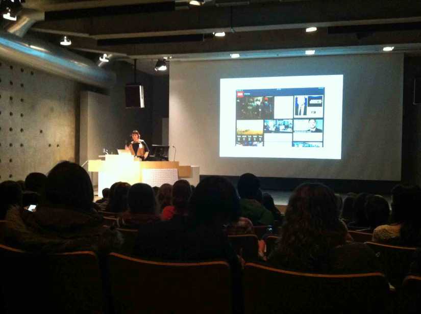
Sean McBride of Typekit: Delivering fonts to the web seemed like it was Typekit’s initial challenge, but it once that was overcome, other challenges presented themselves. Namely, web designers come from many background and they don’t all know how to use type.
With many HCI professionals’ work overlapping so much with designers, everyone is using the typographer’s toolbox. At Punchcut, they used defined three kinds of reading modes to know what kind of typographic application was appropriate.
- Glancing
- Scanning
- Reading
The truest test is viewing whatever you’re working on in context.
Consider localisation when you’re designing user interfaces. It needs to scale, probably after it has left your hands. It’s worth considering the versatility of icons here.
10:15 – Break
10:40 – Brian Warren, Thinking Typographically
Type still keeps us guessing, there is always more to learn.
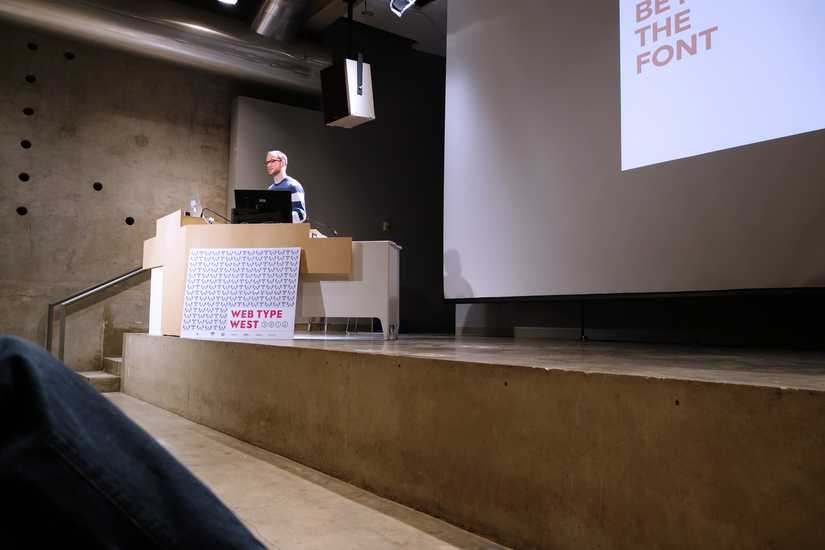
Typography is an opportunity to care. Brian is going to talk about the process and details beyond the typeface selection. Namely, scales, modularity, and otherwise. Also, doing more things that give designers and developers reasons to high-five and hug.
Next is a introduction to modular scales, as an extension of the baseline grids that have been in use for centuries. Brain doesn’t reference Tim Brown’s More Meaningful Typography, but to me this is still the article on the subject of the modular scale.
Brian introduced Sass next as a tool for designers and developers to easily do math in their CSS. He didn’t mention the following links, you but should try Harp to easily write Sass and Bourbon’s modular scale mixin for your type sizes.
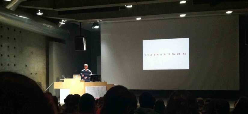
Can you imagine writing CSS using Roman Numerals?
body {
  line-height: XII;
}
We don’t have to thanks to Fibonacci. We’re looking into modular scales a little more now. (Again, see More Meaningful Typography.)
Ah, we’re back to Sass! Brian shows Team Sass’ Compass Modular Scale plugin. I started out with this, but have to admit I prefer Bourbon’s as it is lighter-weight and works with libsass.
He reiterates that typography is a chance to care, which is a great concise summary.
11:15 – Stephen Coles
I was expecting this to be the final talk, I have really been looking forward to seeing Stephen Coles speak!
- What is a typeface?
- What is a font?
- Why are there so damn many, and why should I care?
It’s important to distinguish between a typeface and font for the purpose of this talk (and, I’d agree, in general). Typeface is what you see, and a font is what you use. This talk is mostly going to be about typefaces.
Stephen made the sounds that typefaces made in his head, and we had to follow suit! I wish I had been quick enough to record it, it was quite amusing.
A page is like a room. Type is the furniture.
He notes that aesthetics have a value at that point. Once you sit down in the chair, it is a bad chair if it isn’t great for sitting.
We can think of a typeface as a chair. Chairs are part of people’s everyday life. People don’t necessarily think about the chair they were sitting in, until they notice something wrong.
He continues this metaphor: things that aren’t traditionally chairs can act as chairs. The diversity in type, and the diversity in chairs, etc. This was really well articulated, I have not done a great job of capturing it.
Display type is the showy chair in the hotel lobby. It doesn’t seem functional at first, but what matters is the room needs, and who enters the room.
Beatrice Warde: The more interesting part of The Crystal Goblet is the overlooked portion about pained-glass windows.
Readability is not just can you read it, it’s also do you want to read it.
Metal type: We lost type designed for different sizes when we moved to photo type. Benton Modern, for example, restores this idea in a contemporary manner with different styles intended for different resolutions and hinting contexts.
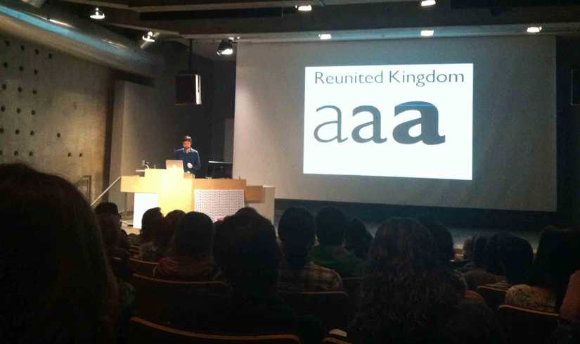
Typefaces and chairs: we still need new designs. Of course, this means we need to review Vignelli’s philosophy. Coles puts it in context better than most do, mentioning the climate
Vignelli didn’t mean it—what if someone told the Eames the chair was already done? I think this is actually true of Vignelli, there are videos of him at Sagmeisters’ exhibitions and though he thinks of him as more of an artist,
Gill Sans: let’s kill a sacred cow. I completely agree with this, Gill Sans’ lowercase is not very useful. I didn’t know there were alternate characters Gill designed that didn’t make it into most digital versions.
Legibility is about individual letters. Readability is holistic, and also includes do you want to read it?
.
Classics don’t deserve their reverence. With age, people act as though they came straight from God. There are a lot of contemporary faces that are terrible, too. Coles does a lot of awesome work removing the mystery around contemporary faces, through Typographica, and knowing how type actually works in context, with Fonts In Use. As a typography student, Fonts In Use is an incredible resource.
Laura Serra did the illustrations for this talk, which were really great.
11:45 – André Mora, Just Right
He doesn’t use Instapaper, RSS, etc. because he respects the connection between where the content itself and where it lives. (I have to be honest, I this perspective is foreign to me. An API or an RSS feed is the way it is, because the web’s content is more important than its setting.)
Paragraph spacing and margins provides the tempo, which is particularly noticeable on small screens. He emphasises this by reading text from a mobile-sized screenshot out loud. It’s pretty convincing: a poem doesn’t read the same on a mobile device with too-large margins, the answers in a Q&A seem like they take long
Mark Boulton’s journal, Bobulate, and A List Apart encapsulate what he’s looking for more, which I can completely agree with. A favourite example, A List Apart uses the condensed style and no large leading on smaller screens. It’s about reading.
CSS properties like line-height are considered too soon. Consider the context, actually be the reader.
1:15 – Typekit Library
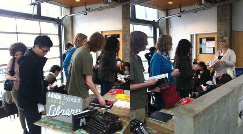
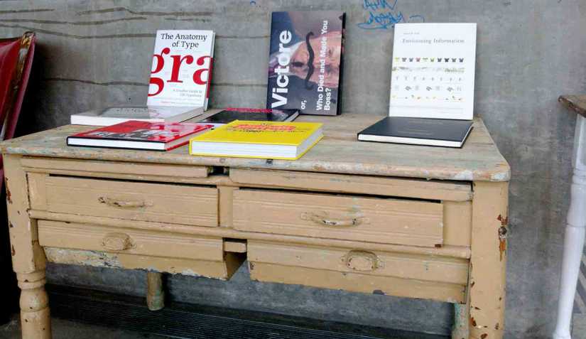
We’re on our lunch break at Web Type West, so I’m enjoying the Typekit pop-up library while it’s quiet. Tschiold’s The Form of the Book, lettering compilations, Victore’s monograph…I could spend a lot of time here.
2:10 – Kevin Larson
Kevin is a psychologist focusing on legibility and readability. He works for Microsoft’s ART foundry. He’s presenting on Sitka, a new typeface by Matthew Carter et al.
They did testing on the typeface, they took into account what they should act on and shouldn’t, and then Matthew Carter did another iteration. We have these typefaces, and we think some are better than others. What can we do to determine if that is ‘true’?
One fear he hears is that science is going to prevent you from doing anything truly good. But it’s not that simple—we can get hints about which typefaces are more legible at certain sizes, under certain tests. We can’t necessarily say why, and it doesn’t make decisions.
Testing like this isn’t new:
- Barbara Roethlein worked with the ATF foundry to do this in 1912
- Beier & Larson’s thesis in 2010
They ran a time threshold test, because when they perform well on that test, the tend to perform better on reading speed (and comprehension?) tests.
Matthew Carter designed two initial versions of Sitka. Both had large x-heights and open counters, but one was more open. They then tested how quickly people recognised letters in context of a few letters. The differences were negligible, but they proceed with the better one.
Second experiment used ball terminals versus flared terminals. The flared terminals performed better except for the a, but that didn’t mean they always chose the one that performed better. It just informed the design decisions.
Third experiment was with Greek Cyrillic, the upright marks versus slanted. The Georgia-esque upright marks surprisingly performed better, even though there was a prior understanding that they were not popular with Greek readers. (My speculation is that, if you read best what you read most, and Georgia has been around, prominently, for a long time, this could have been a factor.)
The data doesn’t tell you what to do. They knew how important having a large x-height there is, but their data showed that it turned out it also compromised the letters with ascenders and descenders. This is probably a good tradeoff for English. Increasing the defenders improved the test results of all these letters.
2:40 – 4:15
…
4:15 – John Hudson, Size-specific fonts for online advertising
He’s not going to talk about traditional book type. He’s going to talk about what’s barely typography:
advertising type. For example, old classifieds. They type is a system, not sensitive decision-making in book type.
In order for these kind of type systems to really work, the typeface has to work; you can’t manually alter things like for one-offs made in InDesign. These faces are rather unsung: a typeface like Adsans, a metal type face for 4¾pt.
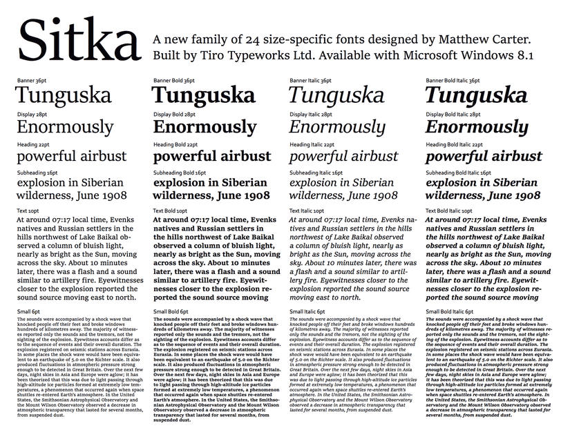
John and his co-founder Ross did the execution of Microsoft and Matthew Carter’s Sitka. (An earlier part of the process was covered by Kevin Larson.)
He ended up working on the web equivalent of Adsans: Google Font approached him to design open source fonts—and he wanted to do something size specific—so they could be used for Google Adsense content.
The Google Adsense team tracked the most common pixel sizes: 27px, 20px, 13px. (As in, CSS px, not device pixels.) The typeface was designed as a system, and then actually designed as fonts to be used at these specific type sizes.
The trend of slab serifs: is the technology driving this design trent? Slab serifs or lower-contrast serifs work well on lower resolutions screens, is that is what is driving the contemporary trend on the web and print of using slab serifs?
One of my own theories about this was that slab serifs are being used as a bit of a middle-ground on the web; designers want to show mature web type while appearing too bookish. That means avoiding overly formal, traditional serifs.
He notes how with classifieds, printer, ink, paper size, etc. would probably (or definitely) be known, but as we know this is not the case for the web.
I found this next part pretty interesting: the 27px version of the typeface had overshoots, but the 20px and 13px don’t because these overshoots would never have a full device pixel in size. In other words, these optical adjustments would have actually made things worse at these type sizes.
This compensation was for y-direction antialiasing, he wanted to get these shapes as crisp as possible. With Quartz rendering, especially on Apple’s lower resolution screens, you’d get fuzzy shapes without this alteration.
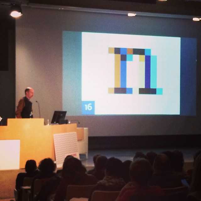
We’re reviewing the letter n next, and how type outline lands on a pixel grid. In this example, on the right size, there is fairly light hazing, but the stroke is mostly there. On the left, it doesn’t land evenly, so the shape of the letter is uneven.
He has hinted this in the 13px version with asymmetric spacing. The contrast is much, much better, with a lot less hazing. The approach to hinting the entire typeface was semi-automated.
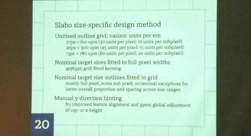
Trying to accurately show web type in a presentation, one a projector you know nothing of really only gives you an impressionistic painting of it.
Slabo is open license (which means it’s available to use commercially for free) and open source (which means the community can contribute). You should definitely Star Slabo on GitHub.
4:50 – Xerxes, Realtype
He was at Veer when Veer was cool.
- Bi Sheng, 1040 – Porcelain movable type
- Gutenberg, 1450 – Credited with movable type
- Hell (that’s his name) – Digi Grotesk, first real digital type
- Xerxes’ grandpa, 1937 – Cinematographer
- Xerxes’ dad, 1967 – Letting
Xerxes is interested in, and part of The idiosyncrasies of the human hand, replicated by machines.
For example, this alphabet by the always-interesting Johnson Banks.
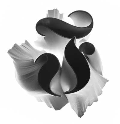
This classic ‘blackletter’ style of fonts is umbilically linked to Germany’s history, being the predominant style for centuries in pre-war Germany.
Now, he runs FairGoods. They produce some really impressive one-take goods, taking the hand made and replicating it with machines or manufacturing it in interesting ways.
