Lettering for SAD Mag
SAD Mag publishes compelling Stories of Art & Design in Vancouver, BC. In November 2015, I worked on some type and lettering for their high school-themed issue.
The article I contributed to is “One in Every Gymnasium: Ivan Coyote on storytelling in high schools,” by Shannon Tien. The piece discusses how transgender activist and author Ivan Coyote speaks to students about gender, sexuality, misogyny, and homophobia.
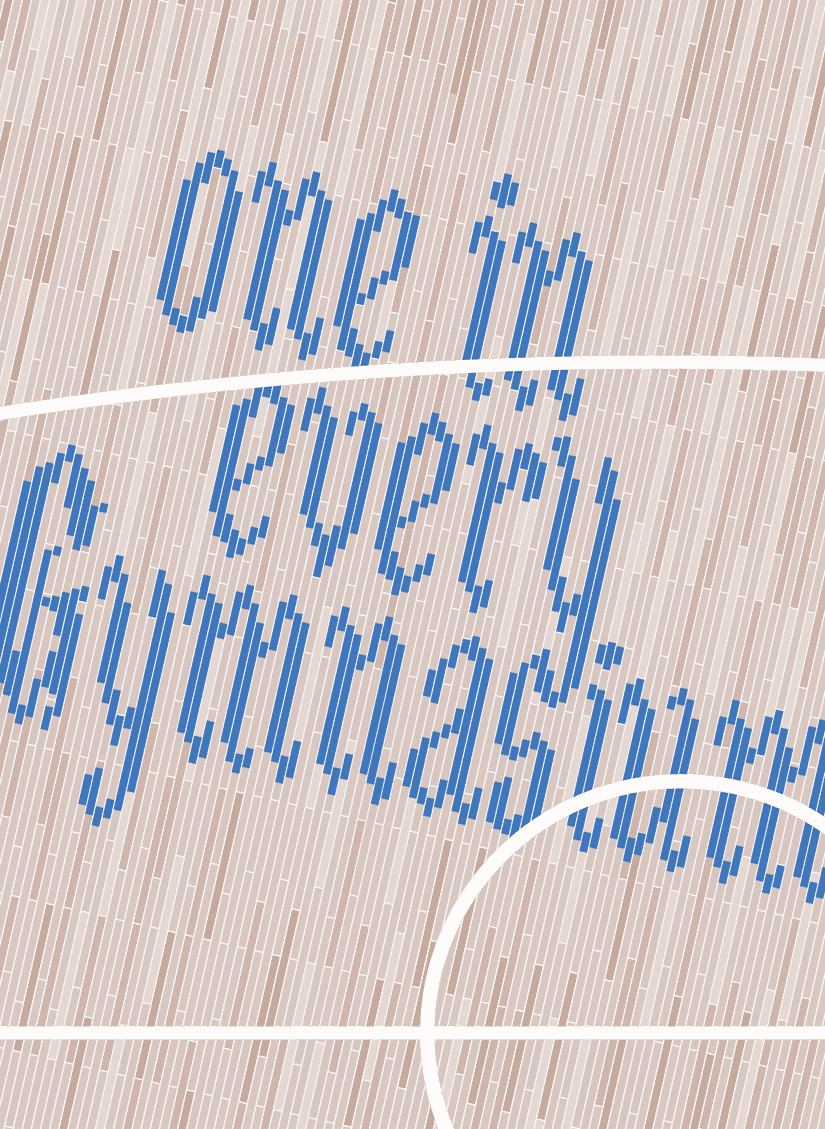
Words by Shannon Tien. Lettering by Kenneth Ormandy. Art direction by Pamela Rounis.
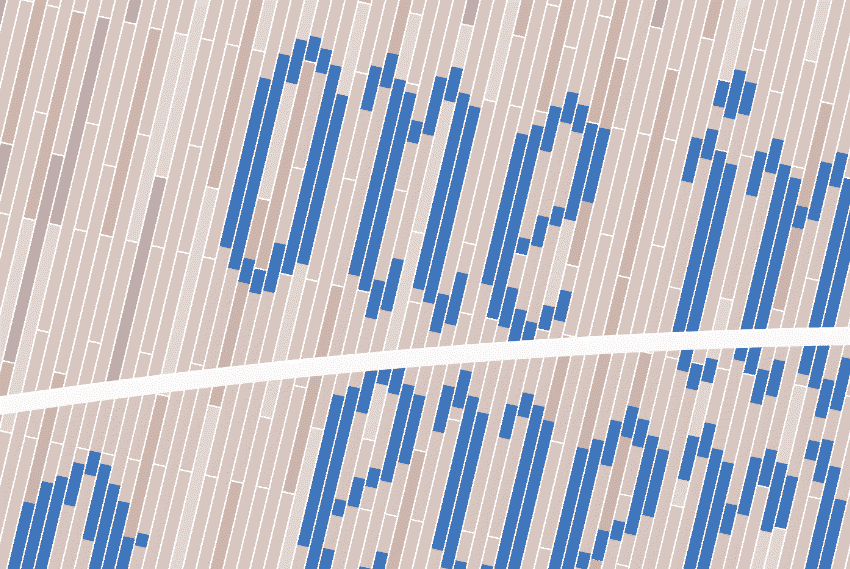
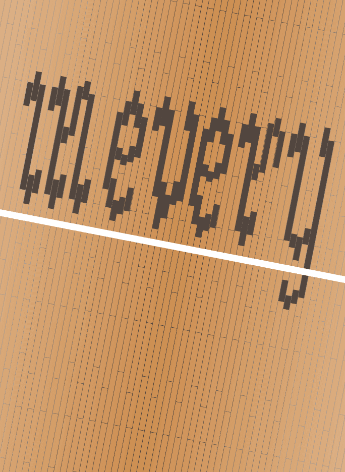
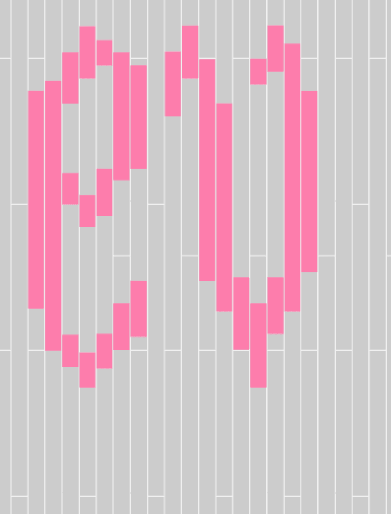
The assembly in school gymnasium is an important moment in the article. My initial sketches featured letters that were already in the gymnasium, like the scoreboard or banners, but eventually I found a relationship between the hardwood floor and the construction of the letters.
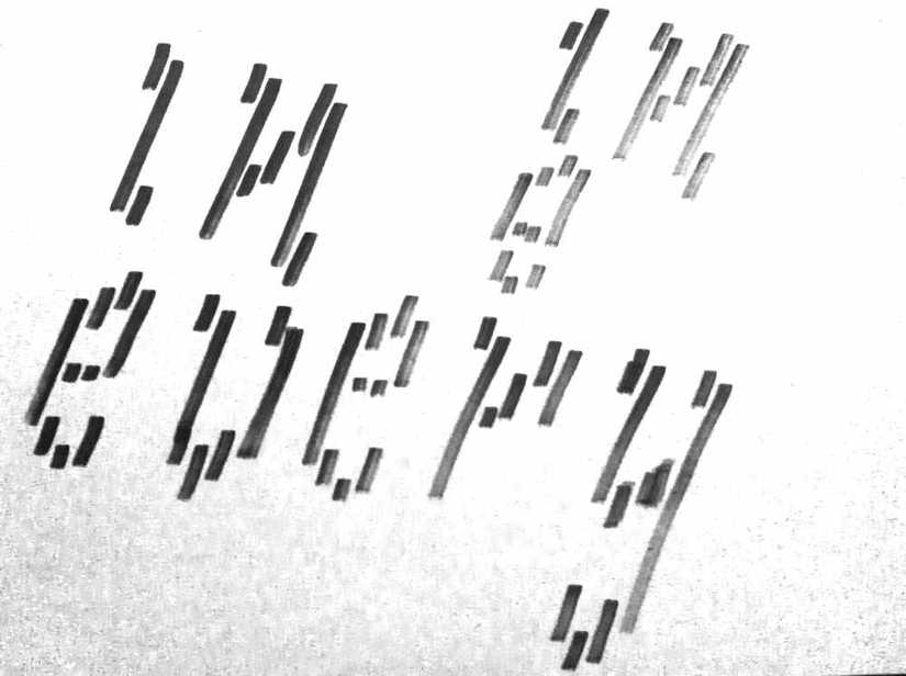
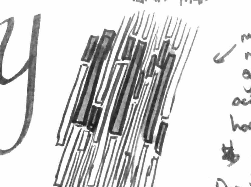
This relates to the article, but less literally than some of my other concepts. Rather, it’s literally and figuratively the foundation of the story: the speaker comes into the school, and everyone is sitting on the same hardwood.
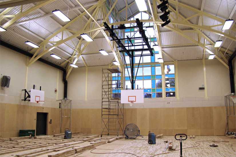
I went to high school elsewhere in Canada, so just to be sure, I checked my assumptions about the reference. It was as you might expect:
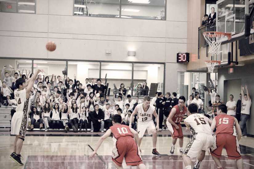
St. John’s School. “Basketball in the Gunn Gymnasium.” 2012. Photograph. CC BY-SA 3.0.
Queen Mary Community School, “Construction at Queen Mary.” 2013. Photograph. North Vancouver School District.
After sending art director Pamela Rounis my initial digital sketches, she suggested I keep developing the higher contrast letters, rather than my initial more mono-linear approach.
Spot numbers
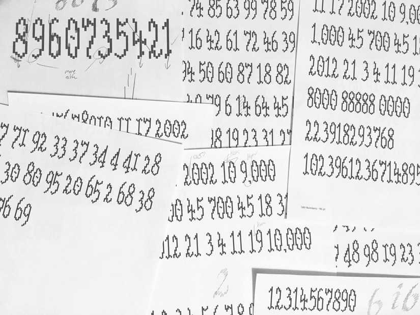
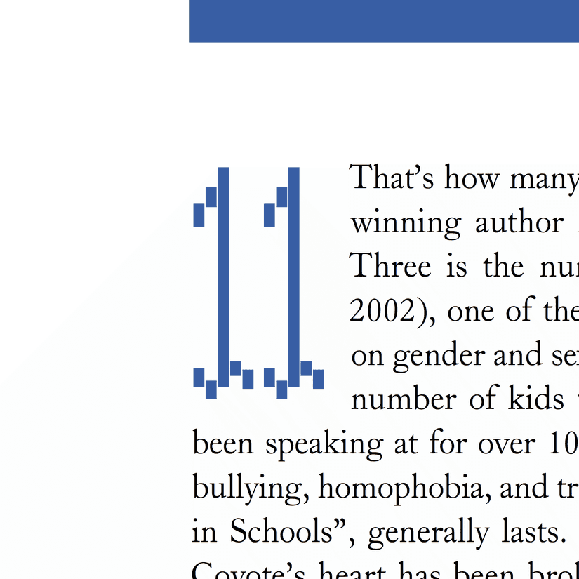
In addition to the title page, I decided to design SAD Mag a numbers-only typeface to work alongside with the lettered title page. This made it possible to add spot illustrations, or highlight the stats and numbers behind the stories of interviewee Ivan Coyote, which feature heavily in the piece.
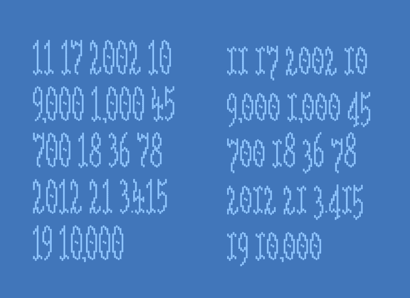
The typeface is built upon the same modular floorboard base as the lettering piece. It includes both Lining Numbers (the default) or Old Style Numbers, which are accessible through OpenType features in the font.
