
Pure CSS lettering, a bad and fun idea
Setting arbitrary constraints is a useful way to stay focused while learning and making type and lettering.
Design is driven by constraints; when a self-initiated project or educational opportunity appears to have none, I’ve found I needed to create rules for myself—or have them created for me. For example, when sketching, many type designers and lettering artists use TypeCooker to generate restrictions they have to use for their sketch.
For a while now, I’ve been collecting alphabets made entirely with CSS by front-end developers and designers. These people who probably wouldn’t call themselves lettering artists, but they are using this same constraints-based approach to letter-making that I’m so fond of. In this case, the browser and the limits of CSS are defining the constraints.

Inspecting one of Diana Smith’s pure CSS letterforms.
One of the best introductions to this is Diana Smith’s Pure CSS Zigario piece. Some of her other pure CSS illustration pieces have rightfully received quite a bit of attention, and explore both how far you can push CSS to make things it wasn’t really intended to make, and how these pieces degrade and break in interesting and beautiful ways in older browsers. Diana speaks about this in more detail in this interview.

An image of the full piece. View it version in the browser.
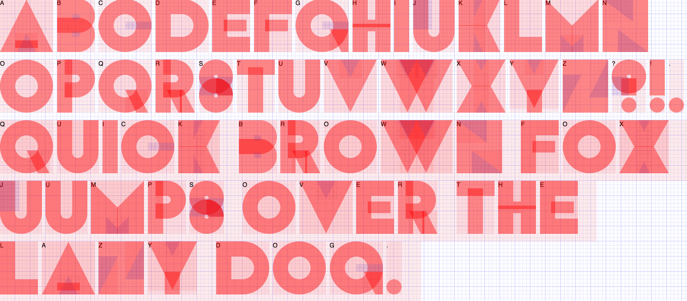
The Zigario piece has both a typographic and illustration component, but Smith has also broken out her lettering into its own CSS “font” project.

A sample of Diana Smith’s pure CSS alphabet.
Rather than manually write out the HTML, you can generate a sample on the project site. The samples show that you can change the colour of the type, the background colour behind it—which is actually quite a feat, which may become more apparent in some of the other examples—and allows you to scale the font size.
The “A Single Div” approach
What are the constraints of these alphabets? To me, the more challenging and interesting approach is where each glyph is made by a single element. In other words, your HTML might look like:
<div class="w"></div>
<div class="o"></div>
<div class="r"></div>
<div class="d"></div>
…and that’s it. This is similar to the constraints of Lynn Fisher’s A Single Div CSS illustration project, where detailed imagery is implemented in CSS using only one div, the idea being that there is a relatively straight-forward way to use the alphabet if you want.
One piece that demonstrates a technique that can be used to great effect for pure CSS lettering and alphabets is Lynn’s embroidery example:

Lynn Fisher’s CSS embroidery from A Single Div
By offsetting a completely solid CSS text-shadow into another location, you can create modular, bitmap-like letterforms. In Lynn’s piece, the unit is the letter “x” from another font, but it’s not being used as a letter, it’s being used as a cross-stich.
CSS Tricks has a great single div Space Invader example that demonstrates this technique, and many of the other techniques used in all the letterforms in this article, called “The Shapes of CSS.”
Using this technique, I supposed you could take this really far and make an entire pixel alphabet. And of course, someone did:
What do you mean “y”
Pure CSS alphabets, like pure CSS illustrations, are a fun challenge and don’t care about following the rules of how the technology should be used—or maybe caring so much about how it can be used and taking it to extreme lengths.
While Diana Smith does make a case for her CSS alphabet as having a practical application in CAPTCHAs, from my perspective, they don’t really need to justify themselves. Instead, they use they use the constraints of the technology to an interesting end, and while you absolutely shouldn’t be looking for a way to bring them into your web development project, they are also a useful educational resource for some pretty advanced CSS techniques.
CSS Sans
The most fully-realised example of this approach that I’ve seen is CSS Sans (2015), by Yusuke Sugomori & Masanari Kakamu:
This alphabet is explained well, demonstrating the techniques needed to work with the limited shape modifications available. Similar to Diana Smith’s pure CSS painting work, how the alphabet degrades is part of the project. A type tester on the site simulates how the letters would fare on older browsers. For example, Internet Explorer 7 and earlier didn’t support before and after pseudo-elements, which are necessary nearly all letters. The alphabet would again appear differently on Firefox 2 or IE8, where border-radius and CSS3 2D Transforms weren’t supported. It’s been quite a while since I had to think about which browsers supported those properties.
The project is open source and open license as well, which has made it possible for people like Martin Lenngren to do a take on a different weight:
Wenting Zhang’s CSS Icons project uses these same CSS techniques, and the wordmark was made with pure CSS:
The icon (and letter) inspector, on Wentin’s CSS Icons project.
Before most of these example, Potch open sourced a project also called CSS Sans in 2011, also using the single div constraint:

A sample of CSS Sans (2011) by Potch.
As Potch succinctly puts it, this is all “A bad idea if not a fun one.”
Here’s another take on a the single element approach, very geometric sans sans-serif from Hugo Giraudel:
Constructed, geometric sans-serif alphabets are a popular approach or reference point for many of these projects. While there is certainly interesting typographic precedent here, it’s also a matter of getting the job done. When you have at most, one element and two pseudo-elements to make your letter, there is only so much detail that’s going to be possible.
I was curious if a different typographic reference point would work better within the constraints of CSS.
Constructing my take
I gave myself a limited amount of time—knowing that I could get distracted by this piece and never actually make it back to this summary—to work on something with a different reference point. This is the pure CSS, high contrast, stencil piece I came up with:
You can hit “Debug” to see where the elements and pseudo-elements are, and see how much is using the CSS border property, rather than background-color. If nothing else, though, I have a much better appreciation for the amount of work that must have gone into some of these alphabets now.
Later on, I found a better version of the kind of stencil I had in mind. While the earlier geometric examples could be seen as following Herbert Bayer’s Universal alphabet, this piece continues Josef Albers’ stencil experiments:
The catch here is that it doesn’t use the single element approach, but regardless it’s one of my favourite examples, and nice to see someone else thought a stencil could work well.
The ball terminals, if you can call them that in this context—where the letter would end and could finish with a circle—are made with border-radius: 50%.
My approach was a bit more triangle-heavy, which included masking the top of the “A” with a pseudo element, and quite a few CSS border triangles.
I tried border-radius circle ball “terminals” on but sticking with the triangles was more appropriate as I was only drawing a few letters and one was a T. I would love to see if someone can pull off this kind of alphabet with the “A Single Div” approach.
Multiple div alphabets
While the single div constraints more sense to me as a challenge, there are some impressive modular, multi-colour alphabets made entirely with CSS too. These tend to be more visually resolved and less obviously pure CSS.
While looking for one more example, I found a entire series from Carine Bigot or c4rin3, which includes some pretty successful multi-element examples:
Another comprehensive, multi-element example was done by David DeSandro in 2013, where he also addressed the question of why you might decide to do this in CSS at all:
Share your collection
Have you seen any other impressive CSS-only lettering or alphabet projects I’ve missed? Nearly every example I’ve come across are in English and focused on the Latin alphabet, so I’m especially curious if anyone has attempted something with similar constraints with a script I’m less familiar with. Please, send me any you think I should add!
Pure CSS alphabets don’t have, and don’t need, a practical application. They also doesn’t need anyone encouraging people to make more of them. To me, it’s interesting that people are doing it—challenging themselves, and bringing together these two areas of design they care about in an unexpected way.