Type@Paris visits the Bibliothèque Mazarine
Type@Paris visits the Bibliothèque Mazarine
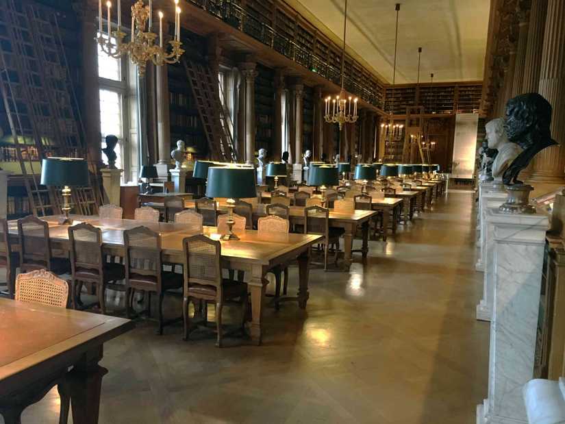
During the second week of Type@Paris we visited the Bibliothèque Mazarine, the oldest public library in France, for a look at some of their most important typo- and calligraphic works.
Our instructors Mathieu Réguer and Jean François Porchez, and Type@Paris alum Benjamin Blaess, had a high standard for photos:
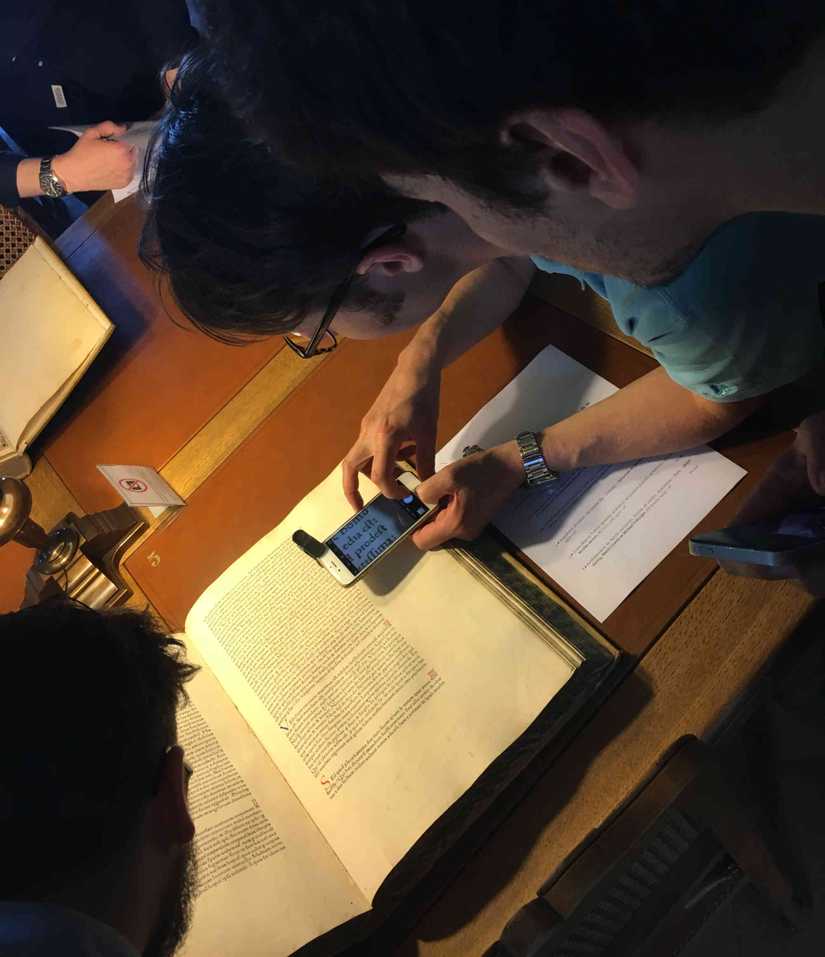
The crew from Typofonderie had a high standard for photos.
Once inside, we looked around the space and learned that this was the first library to be arranged with in an open format with the books along the wall. We also looked at the current exhibition of Italian printers in Paris from the Renaissance—Livres italiens imprimés à Paris à la Renaissance—before turning our attention to the books that had been chosen for us.
We began, as you would, with the Gutenberg bible—well, a facsimile. While I liked being able to flip nonchalantly through one of the most important books of all time, I became more interested in how the facsimile was made. Does it try to replicate the quality of the copy the library holds, or is it a vision of what the book would have been new? I didn’t get a definitive answer for this, but I assume the latter based on the pristine condition of the facsimile.
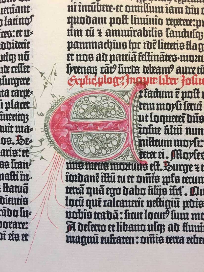
A photo of one of the illuminated dropcaps in the Gutenberg bible facsimile. Matilde and I went through the volume, and there are a lot less than I expected from other photos I’ve seen (something I suppose I’m perpetuating by showing this rather than a page of type alone).
I had similar questions about the Rosetta Stone during my visit to the British Museum (hard to believe I was there only a few weeks ago). The Rosetta Stone facsimile was easier to compare to the (alleged) real thing, which was in a case in the next room. The copy, much like the Gutenberg bible, let you have the experience of interacting with the object as was intended.
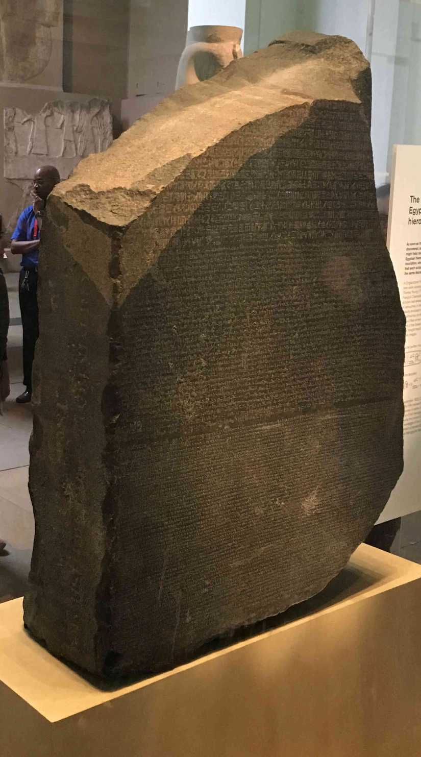
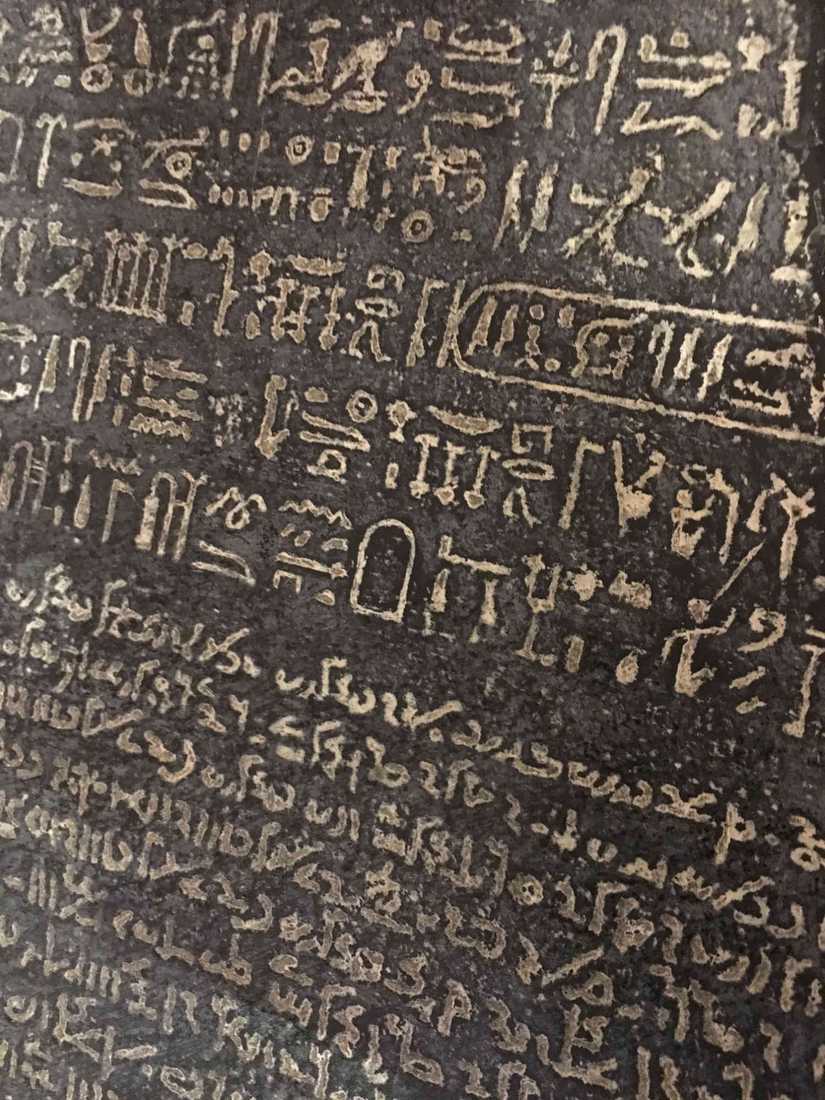
The Rosetta Stone in a case, and the version that you can actually walk up to and touch.
Our guide also says the Gutenberg bible at the Mazarine is one of 49 in the world, and apparently therefore not that rare.
For me, the most practical work present was D. Junii Juvenalis et Auli Persii Flacci satyrae, the satires of Juvenal and Persius, by William Sandby and printed by John Baskerville—or Johannis Baskerville as he is credited. I am working on a Baskerville revival during Type@Paris, and the printing of this book is much more crisp than my other reference.
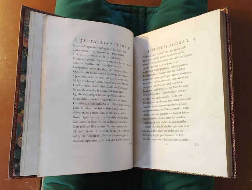
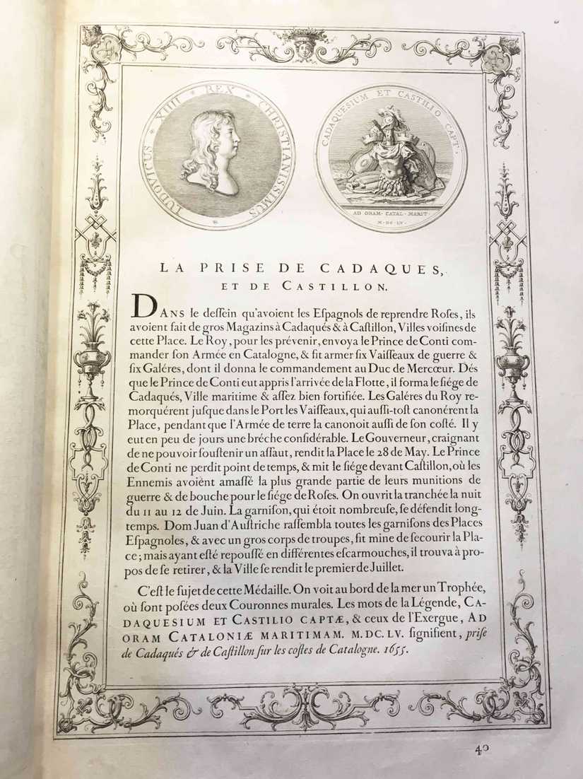
Baskerville used different approaches to printing than his contemporaries specifically because he wasn’t satisfied with how the subtleties of how his letterforms were reproduced otherwise. I’ve read at least one piece on Baskerville argue that he was the first true type designer because he didn’t cut punches himself, instead refining letterforms on paper, but that distinction doesn’t seem to factor in the Romain du Roi. Commissioned for Louis XIV fourteen years before Baskerville was born, it was designed by one team, with the punches cut by another. We saw a version in Medailles sur les principaux evenements du regne entier de Louis le Grand, avec des explications historiques :
Regardless, trying to define who the true first type designer was seems like a futile exercise. One clearer first was in the final section of books that we reviewed: sheet music, from incunabula trough lithography. Most interesting to me was the work of Pierre Attaingnant, who I had previously read about in The Palaeotypography of the French Renaissance by Hendrik D.L. Vervliet for my talk on Haultin and WOFF2.
As our guide mentioned, Attaingnant was the first to start printing the staff and notes together in this way. After, other type designers, including Haultin, went onto specialise in cutting music types for this approach.
Thanks very much to our guide, the Bibliothèque Mazarine, and Jean François Porchez for arranging the visit. If you are near or visiting Paris, the Mazarine is an beautiful space and is (still) open to the public.