
Workflow tips while learning RoboFont & Glyphs
When you’re first learning to draw letters and design type, the process is complicated enough without your workflow introducing additional problems. I’m still extremely new to the process, but in taking Ross Milne’s class a second time through, I can see some optimisations I’ve made since my first type project.
We work with RoboFont in class, and I’ve also been using Glyphs over the last few months. Both are used by professional type designers today. Regardless of your preference, I hope these suggestions help you take shortcuts in learning either program, so you can spend the rest of the time focusing the development of your typeface.
Commit to learning your new tool
If you think there’s even the smallest chance at all you might keep working on your type design project after the class ends, or that you might ever work on a type design project again, don’t start the project in Illustrator or any application you’re already very familiar with. But by investing some time into working exclusively with RoboFont or Glyphs, you’ll work a lot faster once you get over the initial learning curve.
These applications are made specifically for designing type. I still use Illustrator almost daily, but its drawing tools just don’t compare. You’ll likely space your typeface in one of these programs anyway, so it’s really helpful to get familiar with it by drawing there, too.
RoboFont’s drawing tools are fun—they’re more likely to put a damper on Illustrator’s than the other way around.
Memory and the menu
Now, you’re working within Glyphs or RoboFont. The next constraint I have found helpful is no menus: only allow yourself to use keyboard shortcuts.

The RoboFont keyboard shortcut settings panel. Screenshot via the RoboFont docs.
This means, even when I forget how to do something, I have to click the menu, read the keyboard shortcut, and then perform it. This will help you internalise the shortcuts a lot faster. To me, that is well worth the time it costs in the short term if you plan to stick with it.
This is especially important for RoboFont, where certain commands are only active once you assign them a shortcut in the settings.
Many infrequent commands in Glyphs don’t have keyboard shortcuts, although you can apply them at the system level. I haven’t gone to this extreme yet; committing keyboard shortcuts you invented to muscle memory is less valuable than for the standards.
Spacing is significantly faster via keyboard shortcuts than typing in numbers, too:
An introduction to spacing in Glyphs, with and or keyboard shortcuts.
Don’t install too many extensions (yet)
Glyphs and RoboFont both have a steadily growing library of liberally licensed, open source extensions and plugins available for you to use. It’s incredible to see type designers sharing the tools they’ve built.
It’s easy to get excited about all the cool extensions you can use to customise your copy of Glyphs or RoboFont, but at this point in time both programs—Glyphs especially—have almost everything you need.
The exception to this—one plugin absolutely worth installing—is Word-O-Mat. It was developed by the talented Nina Stöessinger and I have found it to be indispensable for generating text on screen, and for proofs. There is also a version for Glyphs available.

With Word-O-Mat, you can generate sample text with very specific requirements. In this case: 25 words with an r and a va pair, no x, 3 to 18 characters, and convert it to all capitals, please.
I haven’t spent as much time with it yet, but another worthy extension at this stage is Tal Leming’s Glyph Nanny. It’s an instructional tool that works inside RoboFont, offering
live feedback about the technical quality of a glyph. The goal is to help new type designers get through the “Béziers Are Frustrating!” phase a little more quickly.
Setup your backups
In technical college, I had my first (little did I know, of many) type specimen project due, and my InDesign file became corrupted the night before it was due. I had no backups. That was dumb, and completely avoidable.
Everyone seems to have one of these stories, and often more serious. Unfortunately, there isn’t much incentive to consider your backups until something happens to you personally. Still, I’m going to do my best to recommend this anyway: have a backup system for your type project.
The importance of easy backups applies to all digital design work, but it’s especially important for a lengthy project like a typeface. Aim to have a system where you’re confident your hard drive could die at any time of the day, and you should only have to worry about losing a half-day’s worth of work at most.
If you have backups, there’s less concern if you’re experimenting and do something inexplicably irreversible to your typeface. I have had a good experience with these tools for my type-related projects:
- Dropbox is much better than not having a backup, but versions are only stored for 30 days.
- Time Machine should be setup for your local backups.
- Arq helps you back up your files like Time Machine, but off-site to the cloud (ugh) for very cheap monthly costs.
- GitHub is my preference for versioning my font files now, but it’s more complicated to configure. I’m working on a tutorial on using git and GitHub with UFO files which I’ll email out soon..
LayerVault is great for backing up and versioning proofs, and you could even store your font source files there if you wanted.LayerVault is closed.
Proof on paper
I should have done a much better job of this in my first time through the type design class: you need to print things out all the time. Even if you’re working on something intended for a screen, it is a lot easier to see certain issues and receive critiques with paper proofs.
InDesign should probably be open anytime you’re working in a room with a printer. If you’d like, you can download and use the InDesign template I’ve been using to proof things. It will automatically update the time you print out your proof, so you won’t mix up which one it is.
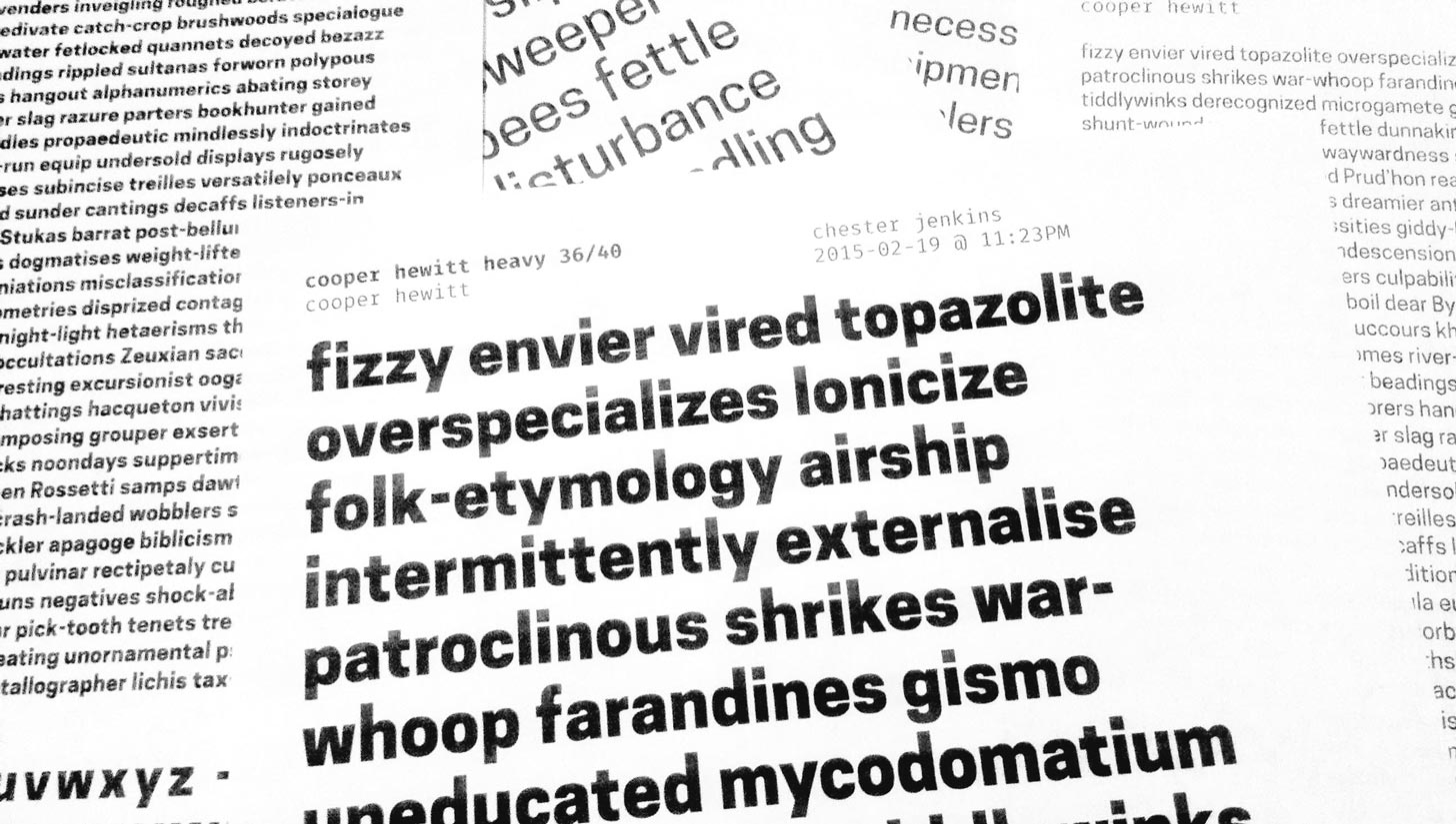
I’ve open sourced the very basic proofing template I’ve been using in case it is helpful to anyone else. Here’s how it looks with the Cooper Hewitt typeface by Chester Jenkins.
You can download it directly or read more about it on GitHub.
Final advice
If I have one last piece of advice—maybe don’t write this long of a blog post until you’re actually done working on your typeface. I should probably get back to what I’m supposed to be doing now.