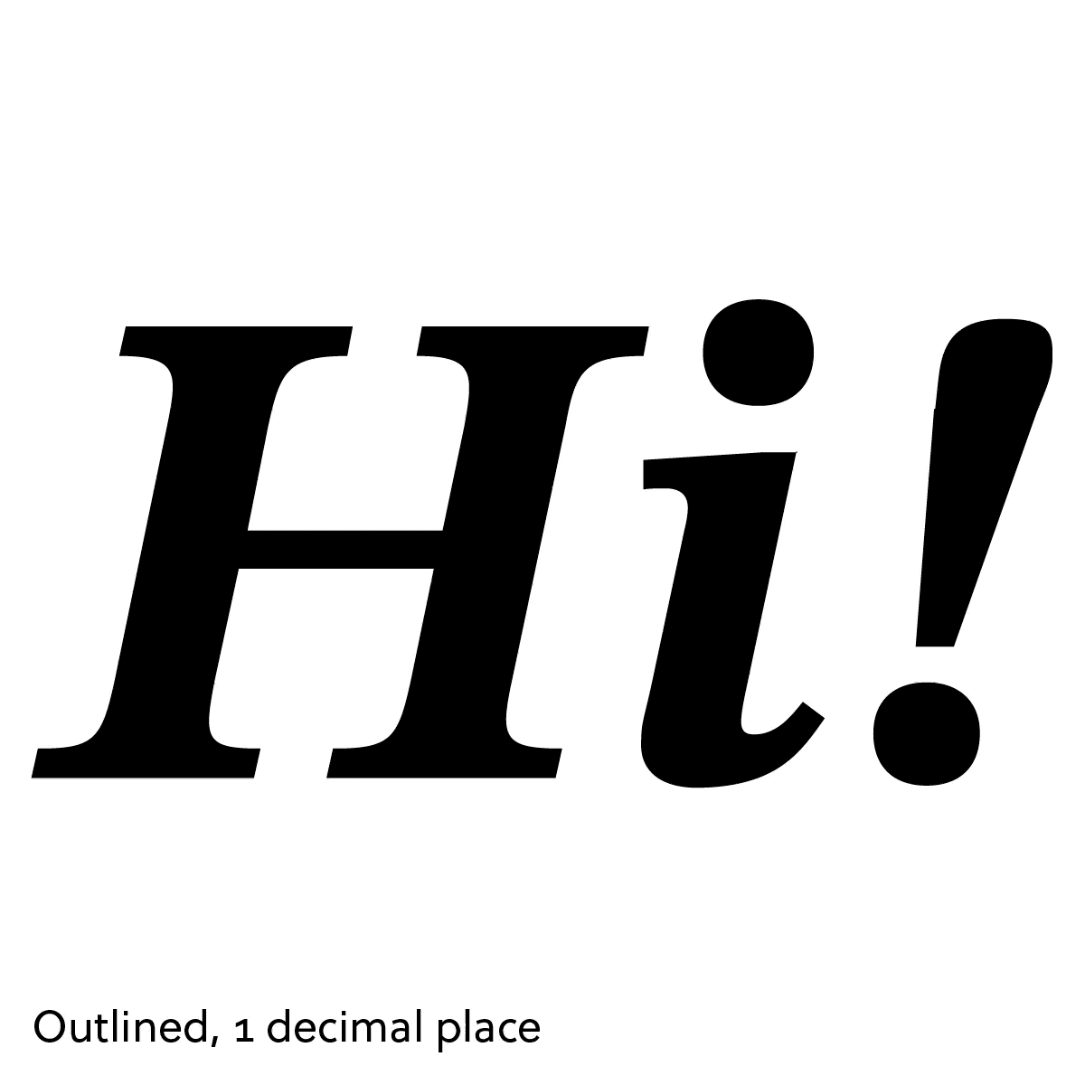
Convert to Outlines
Converting type into oulines, an option while exporting SVGs from a design program, changes it from text within the SVG itself, into paths and shapes.
This will be a familiar to type designers from other design files: it’s exactly the same idea as what happens when type is outlined in Adobe Illustrator and similar. If the type has been outlined, you can’t edit it anymore—it’s all shapes. If the type is still “live,” you can edit the text, but you might not have the font installed on your system.
This is broadly the same as with an SVG: if the type has been outlined, it isn’t text anymore. If you open up the .svg file, you have taken it from something human-readable like this:
<text>Hi!</text>…into something like this:
<path d="M22.76003,48.92144h18l1.96359-9.56766c.94954-5.00831,…" />
<path d="M73.36439,41.57024l-4.69094,22.18263s-.3793,1.77523-.…" />
<path d="M90.29616,67.55619c0,2.91571-1.71072,4.81737-4.94381,…" />
Over-optimized
Unlike in Illustrator, the resulting filesize of assets to be used on the web is a much larger consideration.
When you outline type for an SVG, you also have the additional consideration of filesize, and therefore quality.
You might be frustratingly aware of “jagged” outlined type in an SVG. This probably means someone has exported the SVG to have outlined type, and used a low “decimal places” setting. In other words, the live type has been outlined, but the fidelity of the path coordinates is lower than the live type itself.
Even if you found this tolerable (which, I’m sure, type designers don’t), it’s common for the SVG to run through another optimization step in a web development asset optimizing tools.

This can be something automatic that applies to a team’s entire codebase. This is well-meaning: “smaller filesizes, faster websites,” and it is true that there is often a lot of junk inserted into the SVG that doesn’t actually have anything to do with how it’s rendered.
So that does make sense in many cases, but it might not be desirable when it comes to, say, jagged type in the logo of an important client used large on a testimonial page.
It can catch people out, because the SVG they are using before running it through their asset pipeline might look completely fine, and then this can happen in a place they are less familiar with.
The one upside here is that the more egregious result, the more likely someone is to catch it.
Under-optimized, or needing live type
So, let’s say someone catches this, and improves the fidelity of the outlined type. That should solve the problem for our simplistic “Hi!” SVG, but what about when you have a large amount of content? You can reach a tipping point where the amount of text in an SVG, across SVGs, or because of something special being done with dynamic content, might mean it’s necessary to use the font after all.
Until next time,
Kenneth