Spaced Very Glyph-centrically
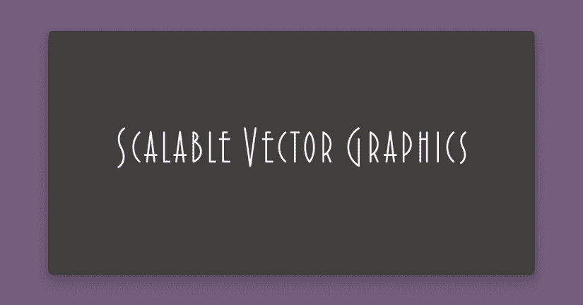
My last message included this sample SVG, still expecting its font to be loaded externally:

Internally, if you were to open it up as a text file, you’d see something like this:
<text fill="white" font-family="Extraordinaire-Bold, Extraordinaire" font-size="50" font-weight="bold">
  Scalable Vector Graphics
</text>
Of course, this is not what a designer is expecting their end readers to see. They are expecting the SVG to be set in your font.
In fact, this incorrect SVG actually required another intervention from me for it to even look that good. In Adobe Illustrator, I changed the kerning from “Auto,” to “0” units before using it in that message. Without that change, it gets exported like this:

If we open up these two SVGs as text files, here is the difference we’d see. Without kerning and tracking, the text element would look something like this:
<text fill="white" font-family="Extraordinaire-Bold, Extraordinaire" font-size="50" font-weight="bold">
  <tspan x="0" y="0">Scalab</tspan>
  <tspan x="108.8" y="0">l</tspan>
  <tspan x="124.1" y="0">e</tspan>
  <tspan x="141.6" y="0"> </tspan>
  <tspan x="151.1" y="0">V</tspan>
  <tspan x="175.6" y="0">ec</tspan>
  <tspan x="209.4" y="0">t</tspan>
  <tspan x="224.4" y="0">or Graphics</tspan>
</text>
Here, the tspan elements are a lot like the span elements you might be familiar with in HTML. They are wrapping individual letters in a piece of text, to make adjustments—in this case, horizontal positioning adjustments.
What’s happened? Illustrator has converted the visual horizontal adjustments—the kerning information you as the type designer built into the font, and any additional manual kerning and tracking the designer applied—into specific x-coordinates.
Of course, this positioning information is intended for use with the specific font it was designed with. The example is supposed to look like this:

An L + E kerning pair makes sense in Extraordinaire, because the E crossbar extends out behind it, and that can be absorbed by the negative space of the L.
Not many other fonts are going to have this requirement, and even another art deco display font is not going to have exactly the same requirements. There might even be a more recent version of Extraordinaire that I don’t have—if I exported this design file using my copy of Extraordinaire, and the web fonts loaded on the site are more recent, it will effectively be using the old kerning information.
SVGs with live text (ie. not outlined) shouldn’t have kerning information included. This is because the kerning can be applied by the live font, in the browser (or other image rendering context).
If the SVG internals didn’t have those tspans like in the original example, the browser can be responsible for applying the kerning information:
<text fill="white" font-family="Extraordinaire-Bold, Extraordinaire" font-size="50" font-weight="bold">
  Scalable Vector Graphics
</text>
It’s counterintuitive, but here’s your rare opportunity as a type designer to recommend a graphic designer zero-out your kerning.
Until next time,
Kenneth