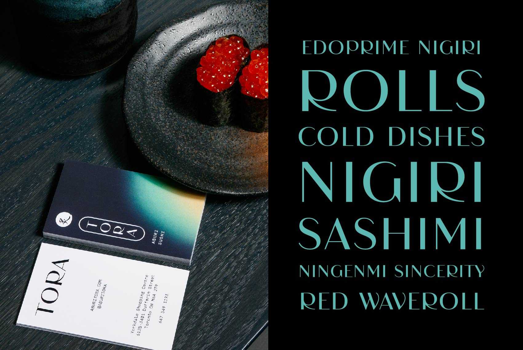
Aburi TORA custom display typeface
TORA is the new restaurant concept exploring the idea of “Japanese tradition meets technology” from the Aburi restaurant group. Glasfurd & Walker designed their visual identity around this.
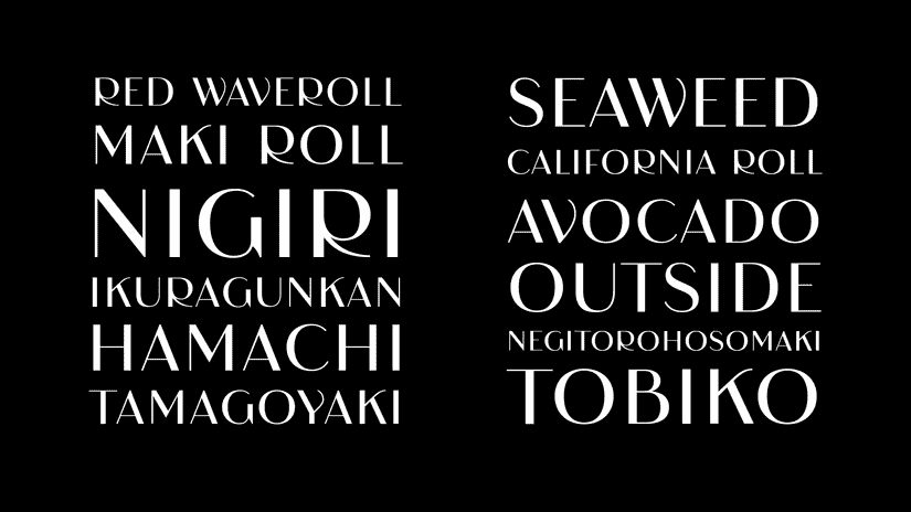
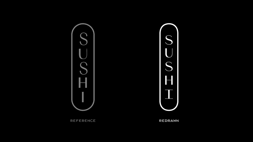
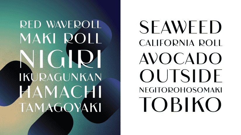
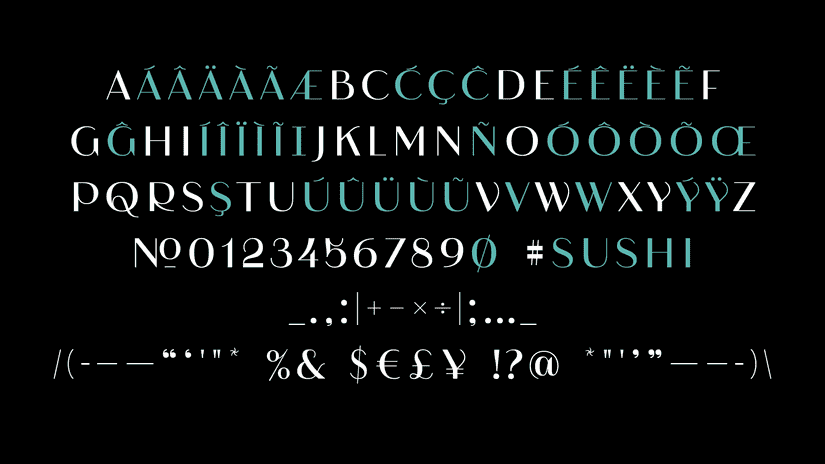
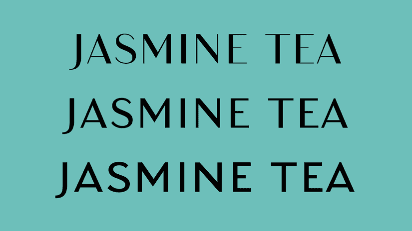
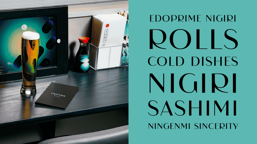
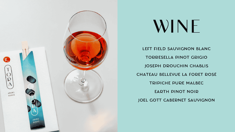
My initial role was to redraw and refine the initial wordmark concept. From there, we expanded the mark into a custom display typeface. It was used as a key part of the identity’s visual voice, on the menus, social media, signage, and more.
Featured
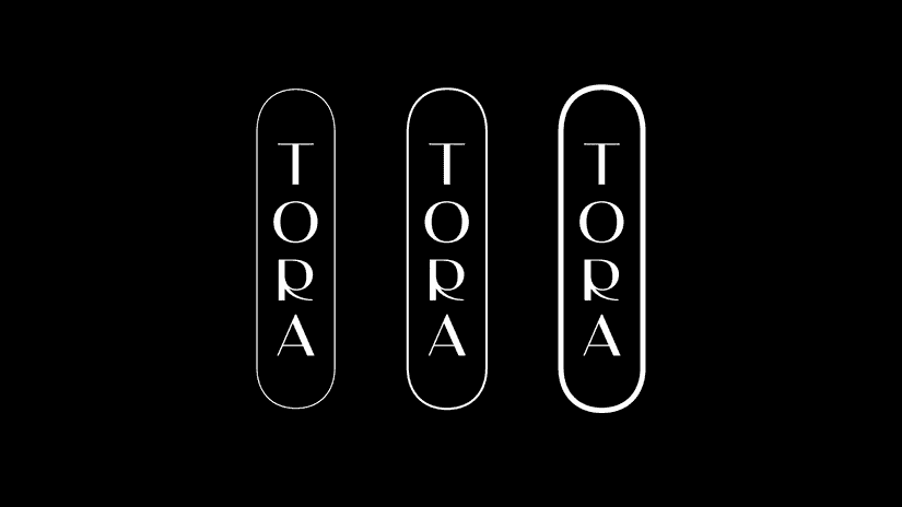
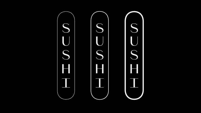
At the center is a beautiful wordmark with an unexpected “R” that looks great in a vertical arrangement and the thin stroke around is a great complement. … The wordmark was expanded into a full alphabet in collaboration with Kenneth Ormandy and aside from being a lovely high-contrast sans serif, it has a few surprises in some of the characters.
- Brand New: Friday Likes
- Brand New: The Best Friday Likes 2019 “Funky and cosmos-y with great typography.”