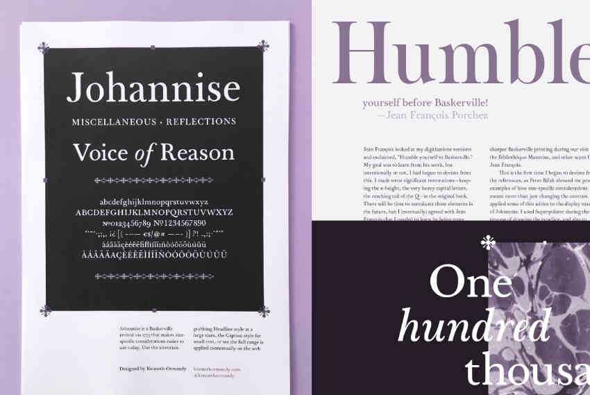
Johannise typeface
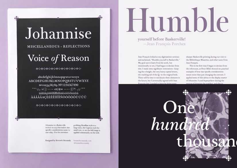
Johannise
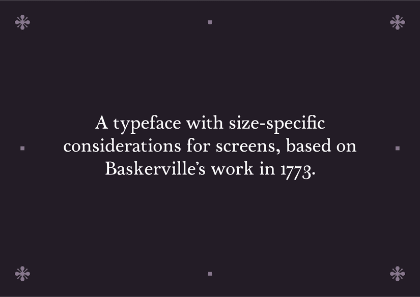
Johannise is a revival with size-specific considerations, based on Baskerville’s work in 1773, designed during Type@Paris.
Typefaces with size-specific considerations can be particularly useful for designers working on the web. They are difficult to use to their full potential, however, due to the massive variety of screens and devices readers are using. I decided to design a size-specific typeface that kept this constraint in mind, for ongoing explorations into responsive lettering and type design.
Size-specific Characteristicks
Like most visual communication challenges on the web, this problem isn’t as new as it’s made out to be: graphic designers have always needed size-specific type—in fact, for a long time, type was size specific by nature.
Each different type size was a physically different object, and different decisions and visual compensations for each size of type. I was reminded of this on many of our visits to different libraries and special collections throughout the trip, including the Typofonderie library. During our visit, Jean François suggested I could design a revival, perhaps basing it on a book he had that used Baskerville type.
The book was Shaftesbury’s Characteristicks of Men, Manners, Opinions, Times. It includes type set in a variety of sizes, from footnotes to larger capitals for the index. These would serve as the reference for the range of styles I would be designing.
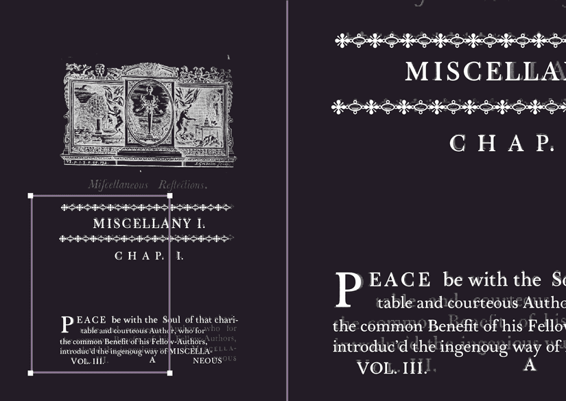
The more I researched the book, the more I became interested in it: Not only did Characteristicks use Baskerville type, it was possible he himself printed the book—certainly, he printed an edition in 1773, two years before he died. Letters suggest that it was Baskerville’s friend Benjamin Franklin who recommended he print the book ten years earlier. In 1914, Josiah Benton wrote it was also a rare instance of Baskerville printing a book he agreed with:
“I think he can hardly be said to have printed a book which represented his ideas, unless it be Shaftesbury’s ‘Characteristicks,’ which was brought out in 1773, and is a beautiful specimen of his printing.”
It even seemed appropriate to review Baskerville’s work in France, where his work was appreciated much more than his native England. Fournier le Joeune even wrote that Baskerville’s italic was “the best found in any type-foundry in Europe” during their day (Benton, 1914). Baskerville’s original type was purchased by a French printer especially to print the works of Voltaire.
Design Process
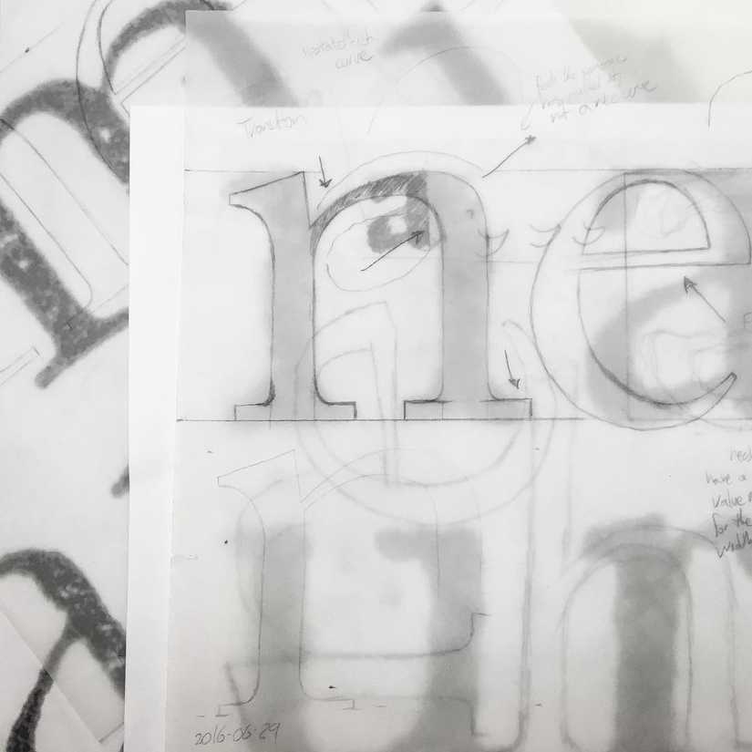
These connections made me even more excited to draw from Baskerville’s work. Our first week during Type@Paris was focused on calligraphy, and then many people moved onto refining their letters at larger sizes with tracing paper. I did the same, but using large printouts of Baskerville’s letters in Charackeristicks. Calligraphy still formed the foundation of Baskerville’s work, and in turn my own, so it was important to have started the program there and return to the fundamentals of the broad nib pen when I was questioning how something had been constructed.
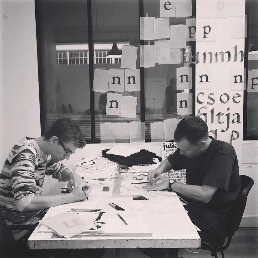
Even with high quality scans and prints to refer to, there is a lot of room for interpretation, especially once I began digitising these letters. I avoided looking at other Baskerville revivals, instead relying on the scans of Characteristics, and the guidance of the instructors.
By the book
Jean François looked my digitisations versions and exclaimed, “Humble yourself to Baskerville.” My goal was to learn from his work, but intentionally or not, I had begun to deviate from this. I made some significant restorations, keeping the x-height, the very heavy capital letters, the reaching tail of the Q, in the original book. There will be time to reevaluate these elements in the future, but I (eventually) agreed with Jean François that I needed to learn by being more faithful to the original.
The styles expand
After completing the basic character set, I began experimenting with a higher contrast master. The type in Characteristicks only got so large, but I was also lucky enough to be able to sharper Baskerville printing during our visit to the Bibliothèque Mazarine, and other scans from Jean François.
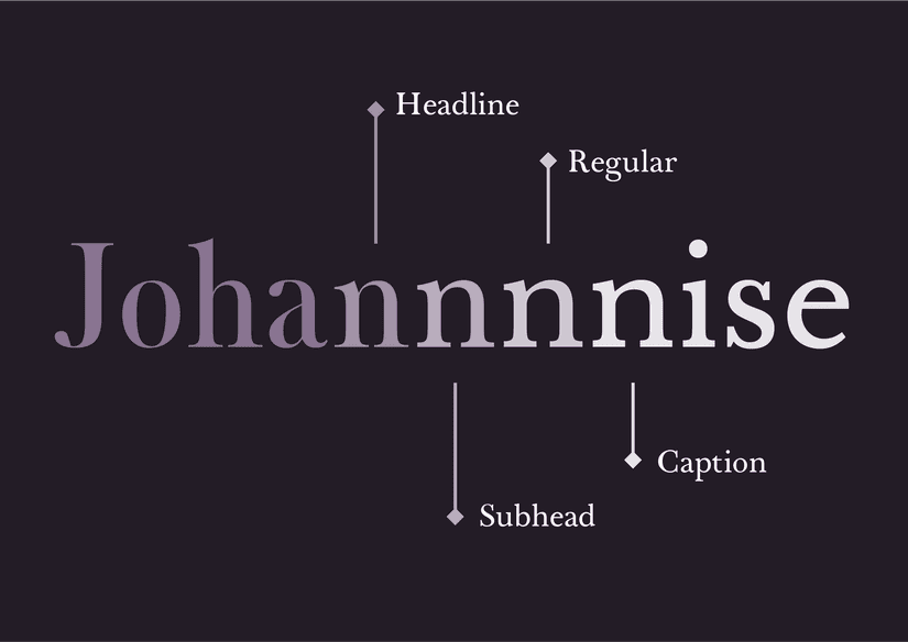
This is the first time I began to deviate from the references, as Peter Biľak showed me practical examples of how size-specific considerations meant more than just changing the contrast. I applied some of this advice to the display master of Johannise. I used Superpolator during the process of drawing the typeface, and also to interpolate the final subhead style. I also extrapolated the basis for the Caption style.
Of course, there is much more I would like to do with Johannise, including additional experimentation with responsive lettering on the web. Perhaps most usefully going forward, in regards to typeface design, Type@Paris has helped me redefine what I should be able to accomplish in a short period of time.
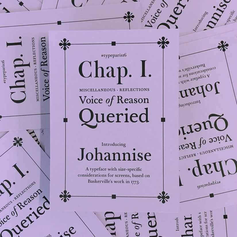
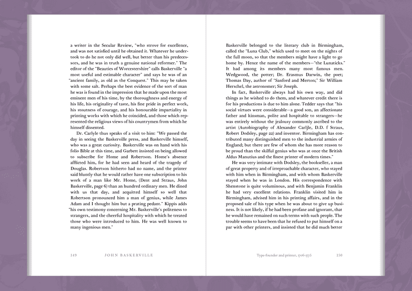
Prints I gave away alongside my final presentation, appropriately printed on British paper I picked up earlier on my trip.