SAD Slices
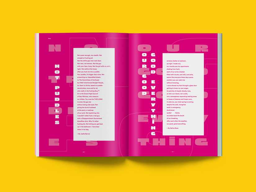
SAD Slices for SAD Mag
SAD Mag publishes compelling Stories of Art & Design in Vancouver, and I design a typeface based on the theme for each issue (or make an emoji font, in the case of Secrets).
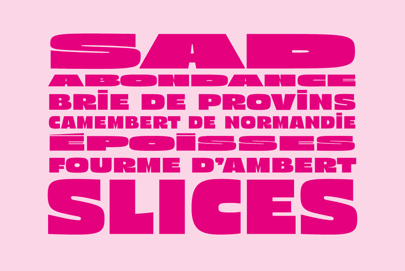
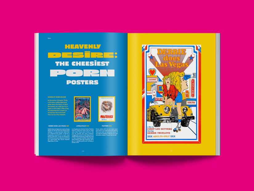
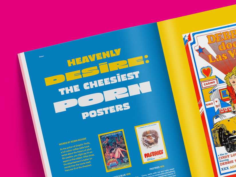
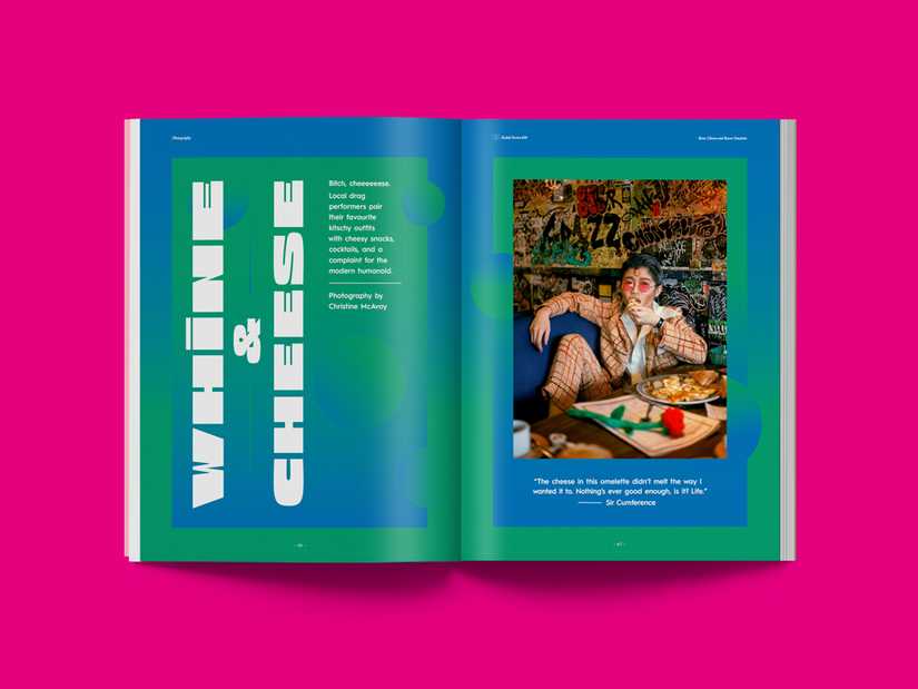
For the Cheese themed issue of SAD Mag, I designed a display typeface with a variety of widths, that was used throughout the issue.
I’ll be releasing an expanded and revised version of this typeface in 2018, and posting more samples then. If you’re interested in licensing it in advance, get in touch. Otherwise, feel free to sign up for my very infrequent newsletter and I’ll let you know when it’s available.
Concept
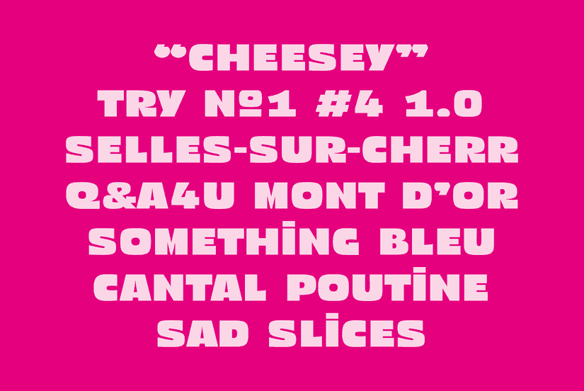
On the plane back from TypeParis, I started sketching a typeface conceptually based a sign a walked by a couple of times. I became interested in something where all the round shapes were sliced off:
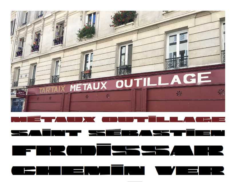
This concept didn’t originally have anything to do with cheese: a sign I saw in Paris got me thinking about removing overshoots entirely as a visual element. Slicing the top and the bottom of the letters let them fit them flat within a tighter vertical space, and became a defining visual characteristic—both seemed like they could be useful for an over-the-top display typeface.
After a critique with Riley Cran, he suggested the typeface wasn’t really doing what I said I wanted it to do. It seemed like the concept was there, but it either needed to become more dense and blocky (DJR’s Fit came out while I was working on this, and fills this space—excuse the pun) or become less literally “sliced” and therefore a more useful display typeface while still being able to give a cheesy vibe.
While considering the latter option, I continued to review some of my materials from TypeParis. I wondered, what if some of the ideas in French renouned type designer Roger Excoffon’s Antique Olive Nord were treated as the lightest, narrowest style of a typeface? This combined well with the figurative and literal qualities of cheese I was already trying to incorperate into the typeface.
