
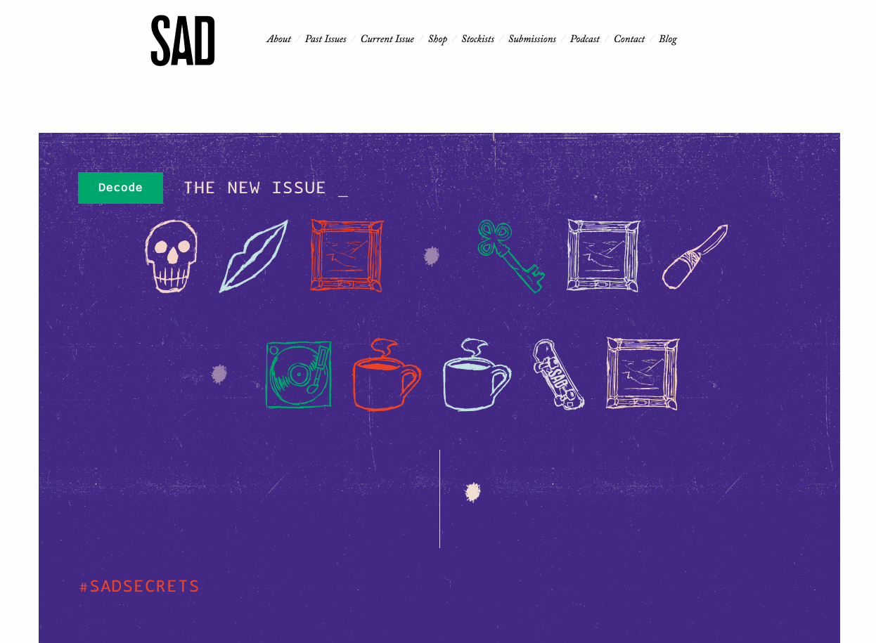
SAD Secrets
Secret code Emoji for SAD Mag
Because emoji aren’t cryptic enough already, I designed a sketchy emoji font and decoder for the Secrets issue of SAD Mag.
SAD Mag publishes compelling Stories of Art & Design in Vancouver. After working on a piece for the High School issue, I was asked to design something for the back cover of the next one.
The themed interpretations of emoji are based on articles in the issue. For example, a piece on secret cabins is represented through a stylised HOUSE WITH GARDEN 🏡. The font allowed SAD Mag to encode secret messages in promotional materials, and readers to decode them online. OpenType feature code within the font automatically swaps in alternate versions of each glyph, maintaining the sketched look.


Typefaces are tools, and one benefit of this typeface is that anyone would be able to set a message in the secret code, as they could write it out in one typeface, and then swap it over to mine to encode it.
The decoder
I also used the typeface on the web to build a decoder for the SAD Mag website that anyone could use.

The decoder was built with portability in mind: it was possible to include it on the site (or potentially other sites) without SAD Mag needing to make any significant changes to their existing website.

Typefaces take a long time to develop, and I was on a relatively short timeline (I had been away at Type@Paris for the summer). We strategically prioritised the project so the right parts of the emoji set were completed at the right times:
- The initial character set only included enough letters for the back cover, in time for the print deadline
- The next major version gave us a large enough character set to build the decoder, and a limited number of alternates
- From there, I added in more alternate characters and the least common letters for the remainder of our promotional pieces
Random enough
OpenType features in the typeface switch between one of three different glyph drawings, to preserve the hastily sketched feeling:
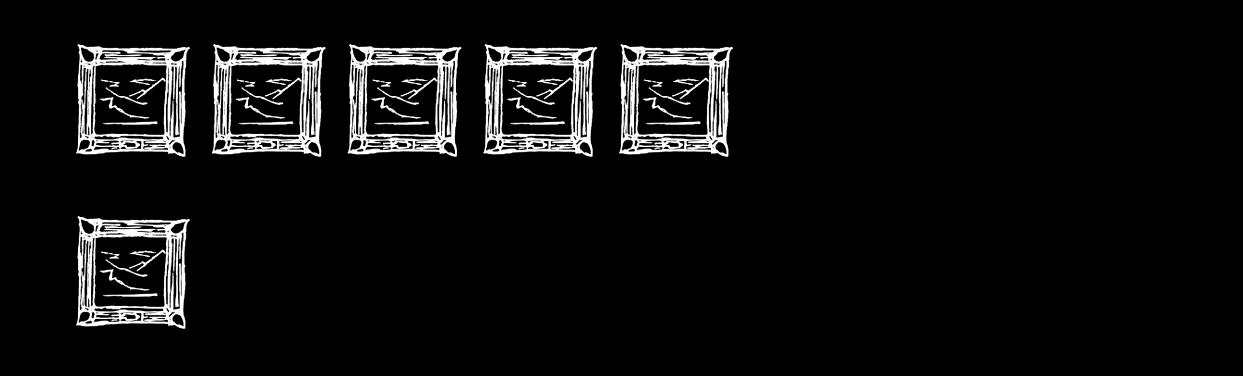
This technique is largely based on Tal Leming’s OpenType Cookbook. While I’m not usually a fan of fonts with textures designed into them, this project was an interestingly weird excuse to experiment within this space.
Are these really emoji?
This is sort of an emoji set—certainly, it builds upon the huge awareness and popularity of them. Most of the glyphs match directly to an official glyph, although some don’t. At press time, the character set covered the 2% of the Unicode 9 emoji that we needed to use.
What imagery was used was largely based on editorial decisions, however: each idea matches directly to an article in the issue of the magazine. There’s a skateboard because there’s an article and photoset on skateboarding—but there’s no skateboard emoji. There’s an article on a concierge society, which I represented with the OLD_KEY emoji 🗝. There’s a 🎤 microphone, referencing the “Mystery Show” article. Some are a themed interpretation of the existing images: there was an article on secret cabins, and this is represented through a cabin based on the 🏡 emoji.
The images that do specifically relate to an emoji are accessible by typing that emoji, in addition to being assigned to a letter in the typeface. All the glyphs then get assigned to a letter in the secret code, so you can type an “A” and get—well, I can’t reveal that, but you can figure it for yourself at sadmag.ca/secrets.